|
This is Jacket # 2 | # 2 Contents | Homepage | Catalog | |
John Tranter: Prose
Lost Things in the Garden of Type
This piece is 3,100 words or about ten printed pages long. It was first published in the October 1997 issue of Australian Book Review.
I went to the South of France recently, to visit my Aunt Helene. She’s getting on now. When she was still a relatively young woman she gave up her typographic practice and moved to a retirement village, the Home for the Disappointed on the little island of San Serife, in the Mediterranean. The people in Bembo, the only town on the island, are mainly employed in the printing and publishing industries, so she feels at home there.
Aunt Helene has her own cottage, with a garden out the back: she calls it the Garden of Type. It’s a place for abandoned things, she says, and typefaces that have been lost and then found again. When the weather’s misty she wanders down there in her slippers and turns over the soil and kicks things around.
Nothing seemed to grow there now, and I asked her what the garden was for. ‘To remind me to remember to remember,’ Aunt Helene explained. ‘Soon I’ll be the only one left who remembers what metal type looked like, or what blotting paper was for.’
‘You sound like Henry Miller,’ I said. ‘I remember he wrote a book called Remember to Remember.’
‘Miller? He remembered nothing. He made things up. Did you know that an ancient Greek invented the art of memory? Simonides. He’d write you a poem for twenty pounds. He wrote a lovely elegy for the Spartans who died bravely at Thermopylae — for a fee, of course. Poets composed and memorised their works in those days. But then someone went and invented paper, and the art of memory has been quite lost.’ She seemed pleased with the thought.
Like her garden, Aunt Helene was full of useless facts and half-baked theories. She has this idea that the size and shape of a page is more or less the same now, in the days of the Internet, as it was for the ancient Greeks. The surface of the page is white, or off-white, and the marks we make — usually black — go from left to right, from one margin to the other. Things have been like that for thousands of years.
She pointed to a neighbouring paddock. The earth had been turned for sowing, and one of the villagers was stumbling over the clods behind an ox and plough as we spoke. ‘Boustrophedon,’ Aunt Helene said. ‘That’s how the Greeks used to write.’
‘Boustrophedon?’
The Greeks took the alphabet from the Phoenecians, she explained, and they spent the first few hundred years deciding on which direction to write. They couldn’t make up their minds. Before about 500 B.C. they used to write from right to left, like the Semitic alphabet they had borrowed, and the ancient Etruscans followed their lead. But after a few hundred years the Greeks thirsted after novelty, and were tempted to write from left to right. The two schools battled it out. Some scribes, devoted to compromise and eccentricity in equal measure, developed what they called “boustrophedon” (“following the ox furrow,” Aunt Helene explained), writing one line from right to left, and the next line from left to right, in mirror writing, and so on alternately down the page. The Etruscans wavered too, dabbling with the ox furrow for a while, but thankfully opting — like the Greeks — for left to right. If they hadn’t, we’d still be confused today, because the Etruscans gave their alphabet — perhaps they were sick of the whole thing — to the Romans, who gave it to the rest of us.
‘Once paper became cheap,’ she went on, ‘you didn’t need to memorise things any more. You could jot them down. Then — two thousand years later — we got printing, universal literacy and slim volumes of verse.’ Her brother Ernest had been a poet. He’d died during the War, and Aunt Helene’s conversation always got around to slim volumes of verse at some point.
There was a garden gnome by the gate, which Aunt Helene insists is really a statuette of a wandering Transylvanian who should have had a typeface named after him, but instead died an unhappy man in 1702.
‘Tell me about the garden gnome again,’ I said, to get her off the topic of Uncle Ernest, and she related the tale of how Mr Kis was lost and found. (‘Pronounced kish,’ Aunt Helene insisted, as she patted the gnome’s head.)
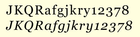
In his book On Type Faces, published in 1923, the great typographic historian Stanley Morison describes a roman and italic typeface that he said was cut by Anton Janson, a seventeenth-century Dutch type foundry owner. By the 1920s the face had fallen into disuse, and when it was revived for the modern age on both Linotype and Monotype machines in 1937, it was named ‘Janson’ after its presumed designer. Even the German Stempel foundry, who owned the original ‘Janson’ punches and matrices from the 1600s, called it by that name. The typeface became more and more widely used. Robert Bringhurst (a poet as well as a typographer) refers to it as a ‘wonderfully toothy and compact Baroque type’. In the United States it is now the third most popular face for book composition, according to its frequency of appearance in the ‘Fifty Books of the Year’ annual exhibition organised by the American Institute of Graphic Arts.
In 1939 Stanley Morison uncovered the embarrassing fact that the face had not been cut by Janson, but even he was unable to put his finger on the designer. It was not until the 1950s that Harry Carter and George Buday discovered that the man who had designed the type was a Transylvanian Hungarian named Nicholas (or Miklós) Kis, born in 1650.
Kis took religious orders and became a teacher, and eventually decided to visit Holland and study typography, as those skills were needed in Hungary.
He turned out to be very gifted at punchcutting, the shaping of metal type, and became so famous in his own time that Cosimo de Medici, the Grand Duke of Tuscany, offered him a position at his court. Kis declined the offer, and returned to Hungary in 1690, determined to spend the rest of his life designing and printing bibles. It was a time of religious and political upheaval in Hungary. The social turmoil, together with personal enmities, shortened his life, and Kis died in 1702, an embittered man. His reputation had to wait 250 years for proper recognition; and such is the conservative nature of the world of type that the typeface he created is still called ‘Janson’.
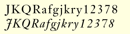
Typeface sample: Janson (Kis)
‘Do you see the bell?’ Aunt Helene asked, when she had finished this gloomy tale. The gnome had a little brass bell hanging around his neck. ‘That’s a trick I learned from Mr Simonides and his art of memory. It’s to remind me of another lost type, called Bell, rescued from oblivion by the Americans. T.S.Eliot liked it so much he used it for his Selected Poems. Of course being a director of Faber and Faber, he could have whatever typeface he liked. He said that poetry was an escape from personality. Did you know that?’
‘Tell me about the bell,’ I said.
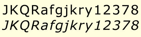
JOHN BELL, an English publisher and bookseller, advertised a book called The Way to Keep Him in The World newspaper in London in June 1787, saying: ‘J.Bell flatters himself that he will be able to render this the most perfect and in every respect the most beautiful book, that was ever printed in any country.’ That was a tall order. In his quest for perfection he set up a type foundry, and hired a young punchcutter named Richard Austin to cut a new typeface for him. The face, named after Bell, was based on a typeface designed some thirty years before by John Baskerville, another perfectionist. Baskerville had said ‘Having been an early admirer of the beauty of Letters, I became insensibly desirous of contributing to the perfection of them.’ Though Baskerville went broke eventually, his typeface was indeed very close to perfection, and went on to become one of the most popular faces of all time.
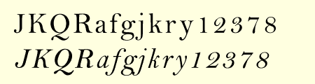
Typeface sample: Bell (Monotype)
John Bell’s type foundry didn’t do well. He closed down his shop within two years and went on to other things, and his typeface sank almost without trace in England. Newer trends in typefaces (Didot in France, and Bodoni in Italy) eclipsed the modest elegance of Richard Austin’s design.
The Americans, though, took a shine to it. It was copied as early as 1792, and always remained popular there. A complete set of type cast from Bell’s original matrices was purchased by the American Henry Houghton in 1864 and installed at his Riverside Press. He thoughtlessly labelled it ‘English Copperplate’. Later, the distinguished American book designer Bruce Rogers used the face frequently, naming it ‘Brimmer’, after the author of a book he’d seen the face used for when he worked as a young man at the Riverside Press. The designer Daniel Updike also worked at Riverside, and also used the ‘English Copperplate’ type extensively in later years, naming his version of it ‘Mountjoye’.
Bell’s type would have remained obscured by these disguises perhaps forever, but for the alert eye of Stanley Morison. He was doing research at the Bibliothèque Nationale in Paris in 1926 when he came across a copy of the first specimen sheet of type samples issued from John Bell’s foundry in 1788. No copy of it existed in England at that time, and Morison recognised the face immediately as the original of the ‘Brimmer’ and ‘Mountjoye’ fonts used in America. He researched the matter and in 1931 published an important monograph which, as the type scholar Alexander Lawson says, ‘returned the name of John Bell to its proper place in the pantheon of English printers.’
The typeface was unique in another way. Until Richard Austin cut the face in 1788, all numerals were traditionally written like lower-case letters — small, with some numerals hanging below the line. Bell is the first typeface to break with that tradition cleanly: Austin’s numerals are larger than lower-case letters (at two-thirds the height of the capitals) and sit evenly along the line. The trend was taken up. These days the numerals in most printed matter are (unfortunately) the full size of the capital letter, and are called titling figures, ranging figures, or lining figures.
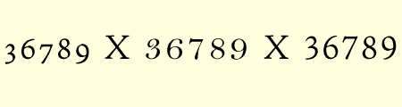
Typeface sample: numerals compared to height of capital X (left to right):
Old style figures (Jenson) X Bell figures X Lining figures (Jenson)
Robert Slimbach designed Adobe Jenson, basing it on a type cut by Nicolas Jenson circa 1470.
‘This Morison fellow seems to have been everywhere,’ I said.
‘Yes,’ Aunt Helene said. ‘He’s even all over the Internet.’
‘Come on, Aunt Helene, he died thirty years ago! He can’t be all over the Internet. We’ve moved on from Mr Morison. There are better typefaces these days. Tell me, as a typographer, what did you think of the typefaces in my Internet magazine?’
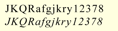
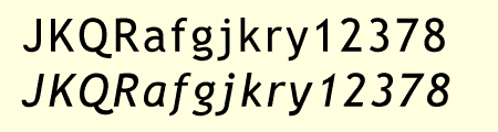
‘Well, when I looked at it yesterday, all I saw was Times New Roman,’ she sniffed. ‘A useful typeface when Mr Morison invented it in 1930, but not very chic these days, I imagine.’
‘You’re not going to tell me you saw Times New Roman in Jacket magazine on the Internet,’ I said. ‘Stanley Morison died in 1967! I only started the magazine a few months ago, and I specified Georgia for the magazine. It’s a new typeface, designed recently by Matthew Carter, the son of Harry Carter, the man you just mentioned, who rediscovered the Transylvanian garden gnome — ‘
‘Show respect!’
‘And for the headings I specified Verdana, another Matthew Carter typeface, and Trebuchet MS, designed for Microsoft by Vincent Connare. These are all brand new typefaces!’
‘You can specify what you like, you silly boy, but what most people will see is Mr Morison’s Times!’ Aunt Helene explained that programs on the Internet use whatever fonts they can find on your computer, starting with Times New Roman, the most common font in the world. If you specify say, Georgia, in the pages you publish, that typeface will only appear on those computers which already have Georgia installed. I ground my teeth.
Typeface sample: Times New Roman
Aunt Helene smiled. ‘What do you have against Times New Roman?’
‘As you know, my dear aunt, it was designed for The Times newspaper in London specifically for legibility and wear resistance on high-speed newsprint presses in the 1930s. It wasn’t designed to be beautiful. And even Stanley Stanley Morison Morison grew to dislike it. In 1953 he said, spraining his infinitives in his annoyance: “As a new face it should, by the grace of God and the art of man, have been broad and open, generous and ample; instead, by the vice of Mammon and the misery of the machine, it is bigoted and narrow, mean and puritan.” I couldn’t have put it better myself. And it doesn’t suit the computer screen. It doesn’t hint very well.’
‘You reeled that off pat. You’ve been studying the art of memory, haven’t you? What do you mean, it doesn’t “hint” very well?’
I explained that ‘hinting’ is the art of fitting each letter of each separate size of a typeface alphabet to the pixel grid that computer screens are made up of. Georgia, Verdana and Trebuchet MS are the first typefaces to be ‘hinted’ so as have letter forms which are shaped differently at each size, to fit over the screen pixels more smoothly.
Typeface sample: Georgia
‘They mightn’t be pretty, but they’re very legible on the screen,’ I said. ‘And they’re contemporary.’
You always get obsessed with the little details,’ Aunt Helene said, ‘and you miss the Big Picture. The great value of the Internet is not hinting, or a fashionable typeface, or being contemporary; it’s the fact that the Internet makes up the first ever computer information mass storage medium that’s archivally useful and lasting, that won’t become unusable within a year or two. It’s like cable television, which is mostly ghastly, but by accident it’s preserving thousand of wonderful old movies that would have disappeared otherwise.’
‘But can’t we already store things on CDs? They last for decades.’
‘The plastic may last, but the machines to read them will disappear. Remember those poems of Uncle Ernest’s that I typeset on the Compugraphic typesetter ten years ago, and stored on eight-inch floppy diskettes?’
I grimaced.
‘When I upgraded to a new system, I found that my new computer didn’t have that kind of floppy diskette drive. It has a newer, smaller kind of drive. I can’t read the old diskettes now. They’re unusable. But if I had stored them on the Internet ten years ago in plain ASCII text, or in HTML, which is a slightly more complicated kind of plain ASCII text, they’d still be readable, and they’d still be readable in a hundred years’ time. I’m so annoyed with myself.’
Typeface sample: Verdana
‘Let me cheer you up,’ I said. ‘I have something for your Garden of Type. You’ll like this — it’s a piece of lost typographical gibberish.’
We went inside for a cup of tea, and I told her about my dear friend the late Martin Johnston’s novel, Cicada Gambit, which was published in 1983. Some months before the book appeared Martin had shown me a page of the proofs with evident delight. The publishers, Hale & Iremonger, had their own computerised typesetting machine, that used punched-paper-tape. In the middle of printing out the proofs for the novel, something went wrong with the computer, and it spewed out a page of gibberish — asterisks, colons, umlauts and random letters.
‘Isn’t it wonderful?’ Martin had exclaimed. ‘I’ve asked them to leave it in.’
But, sadly, the typesetter operator was unable to make the computer produce the gibberish a second time — or perhaps the publisher was unwilling to allow the gibberish to appear under its imprint — and the novel was published without it.
Aunt Helene liked the story, and jotted it down with a pencil she kept in the kitchen. ‘The propelling pencil has been around for a hundred or so years,’ she said, as an aside. ‘It’s an earnest gadget, and to my mind nothing captures the spirit of the Industrial Revolution so well. You’d think the fountain pen or the ball-point pen or the roller-ball would have killed it, but they haven’t.’
‘You’re going to go on about blotting paper, aren’t you?’
‘They were often twinned, in pen-and-pencil gift sets for the middle class Dad on Father’s Day. Who would have thought that, in the age of the mobile phone and the automatic teller machine, it would survive and prosper? The Taiwanese are churning them out.’
‘You must have a theory as to why,’ I said.
Typeface sample: Trebuchet MS
‘Well, pencils use a graphite composite, and graphite is an allotropic form of carbon, one of the most permanent things in the universe: graphite is more stable than diamond, for example. The pencil trace of a message will last unchanged for millions of years after the paper it was written on has crumbled into dust. Yet — I enjoy ironies! — people use it because it’s not permanent, because it can be erased easily. Most people are untrustworthy, sadly, and break luncheon engagements. How many times have you heard the phrase ‘I’ll pencil that in...’? How many times have you said that yourself, already planning to erase it the very next day? Pencils are also ideal for writing on vertical surfaces, for example, notepads stuck to the door of your refrigerator, where biros fail. Biros won’t write at an angle, or upside down. Biro! Another Hungarian! Did you know that the first satisfactory ball-point pen was patented in 1944 by Lazlo Biro, a Hungarian living in Argentina?’
‘That reminds me of the Fisher space pen,’ I put in, not to be outdone. ‘It’s a ball-point pen, and the ink cartridge is pressurised by nitrogen gas, so that it writes upside-down, or even on glass. It was developed at a cost of millions of dollars to do for American astronauts what the one-dollar propelling pencil does for the Russian cosmonauts — to write in space, where there’s no gravity to make the ink run. Or so the urban myth says.’
‘You know, you’re full of useless information,’ Aunt Helene said. ‘Now you’d better go, or you’ll miss your ferry. And I haven’t had time to talk about Uncle Ernest’s poetry. What a shame!’
For the typographical information in this article I have drawn extensively on two books: Anatomy of a Typeface, by Alexander Lawson, Hamish Hamilton (Penguin), London, 1990, ISBN 0 241 13267 3, and The Elements of Typographic Style (second edition, 1997) by Robert Bringhurst, Hartley & Marks, Vancouver, ISBN 9-780881-791327. Lawson’s book is a wide-ranging historical study of some thirty contemporary printing types and their antecedents, and Bringhurst is clear, extraordinarily thorough and up-to-date, with thoughtful advice for the novice. “I wish to see this book [Bringhurst’s] become the Typographers’ Bible”, says the great typographer Hermann Zapf, and he probably will. Both books are amply illustrated. — J.T.
E N D The Internet address of this page is http://johntranter.com/prose/gardtype.html