Alan GoldingVisual Materiality in Bruce AndrewsThis piece is 4,000 words or about twelve printed pages long. |
|
Except for Lyn Hejinian's discussion of the relationships among acoustic, linguistic, and graphic line, Peter Quartermain's analysis of its ‘topological features’ (166) and William Howe’s MA thesis, the visual components of Bruce Andrews' work have received relatively little attention. [Note 1] Yet that work often exhibits great visual inventiveness, and Andrews himself wrote early in his career that ‘the way words fit into a sentence (or a line of thought) doesn't grab me as much as how they relate to the space and silence around them. I like the edges, discreteness, fragments, collision’ (Edge n. pag.). |
| |
Figure 1: 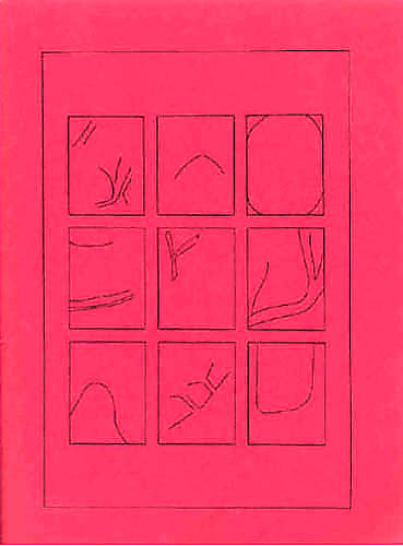
|
| |
Figure 2: 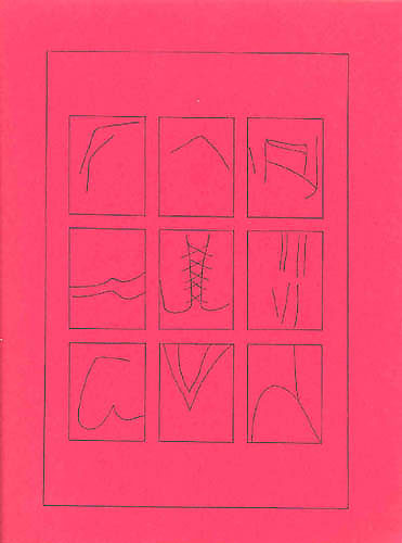
|
| |
Figure 3: 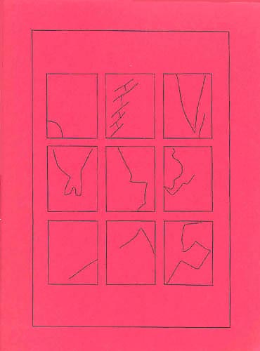
|
|
Such ‘non-word’ material (‘W O R K’ 288) has been part of Andrews’ work ever since Factura (the earliest work in which dates from 1969), and into the glyph-like figures in Love Songs and the rough, unstably geometrical drawings of ‘Unit Costs’ (published in Give Em Enough Rope but written in 1980) (fig. 4). Love Songs contains hand-drawn landscape-like forms, surrounding the words and creating particular clusters of connection and separation (fig. 5); it contains composite glyphs, with the letters barely detectable and syllables or words barely formulable out of them. [Note 7] Songs 144-146 are wordless ‘poems,’ occupying some point between the ‘post-semiotic’ poems of Steve McCaffery’s 1970 Transitions to the Beast and gallery maps (fig. 6). [Note 8] But the use of drawings also seems to elicit what could be read as moments of self-critique. ‘No 11’ repeats six simple hand-drawn shapes in an irregular sequence through a pageful of boxes or frames, over the handwritten statement ‘so now you’ve got the small ball of wax’ |
| |
Figure 4: 
|
| |
Figure 5: 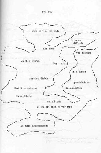
|
| |
Figure 6: 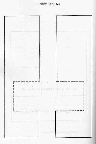
|
|
A different kind of gestural trace shows up in Andrews’ highly self-conscious use of handwriting, as that apparently most intimate and idiosyncratic form of physical production becomes another means to foreground the importance of materiality for his work. He comments on his handwriting in a couple of early journal entries: My handwriting — & casual proclivity for printing — the style of it, the angular precision — isn’t completely a personal gesturing, or expressiveness, but is, really, an attempt from long ago to echo the text — to transform my writing into a reflection or personal figuration of ‘text’ — a result, another one, of my whole love affair and obsession with print, with the qualities which differentiate or distinguish it as text: ‘textuality.’
And again, ‘my handwriting — had to be “printlike” so I could read my writing just like it were a book, text’ (Divestiture—E, n. pag.). Andrews’ handwriting, that is, takes its form from his desire to defamiliarize it as a somatic production and have it take its place in his published work as a material form that will ‘echo the [printed] text.’ On the cover of one of his earliest books, Edge (1973), the title and author name are handwritten but barely detectable as such, and an important statement of poetics about halfway through the book comes in the form of a handwritten letter in which Andrews compares the words on his page to ‘the interrelated pieces of a non-representational ceramic sculpture’ (n. pag.) [Note 10] The threat to linguistic authority made by the manipulation of the words on the page was that it returned the written language to the specific place, instance, conditions of production — it became a highly marked text. The unmarked text, the even gray page of prose and poetic convention appeared, as it were, to ‘speak itself.’ Its production codes lent the text a transcendent character. The text appeared, was there, and the unmarked author was indeed the Author of the Text as pure Word — with all the requisite theological resonance. (Visible Word 46)
The marked text, then, becomes by contrast anti-authoritarian and anti-transcendent. Meanwhile, behind that ‘even gray page’ of convention there lies an image from those ur-materialists and theorists of faktura, Khlebnikov and Kruchonykh, from ‘The Letter as Such’: ‘You’ve seen the letters of their words — strung out in straight lines with shaved heads, resentful, each one just like all the others, gray, colorless — not letters at all, just stamped-out marks’ (257). [Note 12] |
| |
Figure 7: 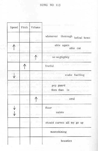
|
|
But for all the variousness and inventiveness with which Andrews treats the idea of the line in his early work, one problem arises, acutely explored by P. Inman. While multiple productive connections are possible among the words and part-words laid out on Andrews’ page, when each word occupies its own space or line in carved isolation it risks the very iconicity that Andrews is seeking to explode. Inman wonders if the lines read ‘as tableaux,’ with the poem overall a ‘still-life stood on its head’ and ‘the sculptural, edged quality’ and ‘physical presence and tangibility of the lines’ producing an effect of stasis: ‘the early work as paused. A constant push against momentum.’ In Inman’s reading, ‘a visual writing, disavowing penetration. * * * Pure scan... visual surface’ can even come to seem, against its own best intentions, ‘authoritarian,’ and he notes Andrews’ subsequent recognition of ‘the need for another mode of line, one that’d forestall objecthood.’ (88–89). Drucker writes of the visual line in general as ‘refusing to stay ‘in line,’ however, ‘creating instead a visual field in which all lines are tangential to the whole, which is, in turn, created as a figure from their efforts, their direction, their non-alignment’ (Figuring 140). Consistent with this view, Andrews’ short essay on lineation, ‘Lines Linear How to Mean,’ confirms his characteristically disruptive intention for his lines as ‘suggesting an unmappable space, no coordinates, troubling us to locate ourselves in formal terms’ (Paradise 119). |
Notes[Note 1] Rachel Blau DuPlessis observes in Andrews the ‘drift, as there is in all writing which faces the materiality of the signifier, to visual texts and to musical texts. Some of the poems are even well served by being seen as grids, along the lines of minimalist visual canvases’ (49). For John Taggart, ‘the pages of Film Noir have a specifically Mondrian look... about them,’ and ‘the visual design of the page is important beyond usual concern for layout appearance’ as part of Andrews’ effort ‘to have the reader come to a heightened experience of language’ (67). Ron Silliman describes the page space of Wobbling as something ‘which Andrews explores (exploits) through design, at moments to the point of seeming painterly (even the prose is double-spaced so as to appear striped)’ (158). In the Aerial special issue on Andrews, a number of responses match his own typographical and spatial experimentation in various ways: see Lang, Brown, Debrot, Retallack, Wallace.
[Note 2] See the online remediation of Steve McCaffery’s Carnival at
[Note 3] It is worth noting the engagement with the visual arts and with verbal-visual cross-fertilization reflected in Andrews and Bernstein’s editing of L=A=N=G=U=A=G=E magazine, which featured visual and conceptual artists (Susan Bee Laufer, Lawrence Weiner), film-makers (Abigail Child, Henry Hills), book artists, visual poets, and intermedia artists (Johanna Drucker, Karl Kempton, Karl Young, Dick Higgins), and a revived Futurist, Gino Severini. The magazine included numerous reviews of visual-verbal works, and graphic texts by David Bromige, Douglas Messerli, Laszlo Moholy-Nagy, Barrett Watten, Severini, and Brita Bergland. Consistent with L=A=N=G=U=A=G=E’s genre-blurring project, reviews and graphic texts were sometimes one (in the cases of Bromige and Messerli). Andrews’ own contributions included his commentary on visual components in the work of Michael Frederick Tolson (‘Layout’), Ernest Robson (‘The Politics of Scoring’), and Loris Essary (‘Line Sites’); his text composed of phrases from, and in the manner of, poet/film-maker Frank Kuenstler’s Lens (‘And For Anything’); and his two-part bibliography of articles relevant to experimental poetics, with its heavy emphasis on art and film journals (‘Articles’). Even more apposite and striking, though much less well-known, is the Andrews-edited issue of Toothpick, Lisbon, & the Orcas Islands (number 5, fall 1973), with its almost complete emphasis on the graphic text and its juxtaposition of early Language writing with work by conceptual artists such as Robert Ashley, Arakawa, Sol LeWitt, Lawrence Weiner, and Vito Acconci. Both periodicals are most easily available at Craig Dworkin’s Eclipse site: for L=A=N=G=U=A=G=E, [Note 4] Compare Steve McCaffery’s remark from a widely cited early essay that ‘the cipheral [or graphic] text involves a replacement in readerly function from a reading of words to an experiencing of graphemes, for conventional reading involves the use of referential vectors and it is such vectors that are here removed’ (‘Death of the Subject’ n. pag.). [Note 5] See the essays ‘Suture — & Absence of the Social’ and ‘Beyond Suture,’ on Susan Howe, in Paradise & Method (227–34), with their ‘nod toward the treatments of ‘suture’ in film studies and post-structuralist political theory’ (227). The term also forms part of Andrews’ analytical framework for essays on Michael Davidson (219–26) and Barrett Watten (235–45), and his ongoing poetics project Tips for Totalizers (251–53). [Note 6] Elsewhere Drucker is careful to separate her use of the term ‘trace’ from its Derridean associations: ‘the concept of écriture, of writing as trace... does not contain a condition for the apprehension of materiality’ (Visible Word 39). Steve McCaffery cites this distinction and goes on to develop a useful, materially centered mini-history of non-normative typographies and alternative writing systems in his essay ‘Between Verbi Voco and Visual, Some Precursors of Grammatology’ (Prior to Meaning 105–24). [Note 7] See . [Note 8] See, for instance, McCaffery, Seven Pages Missing 18. [Note 9] Compare Taggart’s reservations about what he sees as the ‘small range of possibility’ available in a visual writing even of such ‘bravery and sophistication’ as Andrews’: ‘It can force or encourage a more conscious experience of language; it can produce varieties of irony in the process. It is not clear that it can do anything else’ (68–69).
[Note 10] Edge is most readily available at [Note 11] At the same time, Divestiture—E illustrates some of Andrews’ reservations about conceptual art and minimalism: ‘Something overwhelmingly NewYorkish about the ‘tone’ of conceptual art — very stylized, yet artificial, grim, obsessive’ (n. pag.). [Note 12] Given his investment in visual materiality, it’s unsurprising that Andrews would publish what he calls a ‘non-word collection’ (‘W O R K’ 288) titled Factura, after the Russian Futurists’ term for attention to the materiality of one’s medium. Faktura was originally a visual art term adapted for poetry. Futurist attention to language, in Johanna Drucker’s words, ‘relied on the imposition of the notion of faktura, attention to the making of a work of art, especially to the resultant qualities of its surface, onto verbal material’ (Visible Word 175). [Note 13] The grid made of letters, letter-clusters, words, or parts of words is a form running through much of Andrews’ early work. See BothBoth; in Love Songs, see ‘No 114.’ [Note 14] Gilbert Adair also captures nicely how Andrews uses typography to elicit competing modes of attention: ‘That every word in ‘Swaps Ego’ begins with a capital and is set off by two spaces on either side makes a happily fluent reading impossible; but to stop and ponder each word-unit in the 40 pages is, of course, to peter out in mystified exhaustion and complete loss of the rhythm / sense-shifts’ (108). McCaffery frames what he too calls the ‘iconicity’ of Andrews’ early work more positively than Inman in praising the ‘strong object quality’ of Andrews’ ‘lettristic clusters’ and their function ‘as pure space-time arrestments’ (‘Death of the Subject’ n. pag.) [Note 15] See Mallarme in Prose 125–33.
[Note 16] Having chosen what I still think is a fitting quotation, I discovered that McCaffery uses it to conclude his essay ‘Between Verbi Voco and Visual.’ So much for originality, once again. |
Works CitedAdair, Gilbert. Rev. of Give Em Enough Rope, by Bruce Andrews. Reality Studios 10 (1988): 101–09. Andrews, Bruce. ‘And For Anything That I Could Call My Own Thinking.’ L=A=N=G=U=A=G=E 13 (December 1980): n. pag. ———. ‘Articles.’ L=A=N=G=U=A=G=E 3 (June 1978): n. pag. ———. ‘Articles, Part Two.’ L=A=N=G=U=A=G=E 4 (August 1978): n. pag. ———. ‘Bruce Andrews Interview May 1990, Vancouver.’ With Kevin Davies and Jeff Derksen. Aerial 9 (1999): 5–17 ———. Divestiture—E. Buffalo: Leave Books, 1993.
———. Edge. Washington, DC: Some of Us, 1973. N. pag. ———. ‘(editor’s excerpts from) NOTES ON C, W & Z.’ Toothpick, Lisbon, & the Orcas Islands 5 (fall 1973): n. pag. ———. Factura. Madison, WI: Xexoxial Editions, 1987. ———. Getting Ready to Have Been Frightened. New York: Roof, 1988. ———. ‘’How Poignant That Sounds, Even As You Read Back the Transcript.’ An Interview with Bruce Andrews 10/3/95.’ With Charles Bernstein. Chloroform: An Aesthetics of Critical Writing. Buffalo, 1997. 185–206. ———. ‘Layout.’ L=A=N=G=U=A=G=E 3 (June 1978): n. pag. ———. ‘Line Sites.’ L=A=N=G=U=A=G=E 4 (August 1978): n. pag. ———. Love Songs. Baltimore: Pod, 1982. ———. Paradise & Method: Poetics & Praxis. Evanston: Northwestern UP, 1996. ———. Poetics Talks. Calgary: housepress, 2001. ———. ‘The Politics of Scoring.’ L=A=N=G=U=A=G=E 2 (April 1978): n. pag. Reprinted in Paradise & Method176–77. ———. StandPoint. Oakland: Score, 1991. ———. ‘Verbal Sallies.’ Hot Bird Mfg 1.3 (November 1990): n. pag. ———. ‘W O R K (-dated from earliest items included-).’ Aerial 9 (1999): 284–88. ——— and Bob Cobbing. BothBoth. London: Writers Forum, 1987. N. pag. ——— and John Bennett. Joint Words. Columbus, OH: Luna Bisonte, 1979. Brown, Lee Ann. ‘Coptic b.’ Aerial 9 (1999): 124–25.
Debrot, Jacques. ‘:: Deleuze, Gilles, and Felix Guattari. A Thousand Plateaus: Capitalism and Schizophrenia. Vol. 2. Trans. Brian Massumi. Minneapolis: U of Minnesota P, 1987. Drucker, Johanna. Figuring the Word: Essays on Books, Writing, and Visual Poetics. New York: Granary, 1998. ———. The Visible Word: Experimental Typography and Modern Art, 1909-23. Chicago: U of Chicago P, 1994. DuPlessis, Rachel Blau. ‘Surface Tension: Thinking About Andrews.’ Aerial 9 (1999): 49-61. Hejinian, Lyn. ‘Hard Hearts.’ Aerial 9 (1999): 63–69.
Howe, William. ‘Remeaning: Sound, Text, Space, and Song.’ MA thesis, U of Maine. Inman, P. ‘Early/Later: 2 Scenarios For/On Bruce Andrews.’ Aerial 9 (1999): 88–90. Khlebnikov, Velimir, and Alexei Kruchonykh. ‘The Letter as Such.’ Collected Works of Velimir Khlebnikov. Ed. Charlotte Douglas. Trans. Paul Schmidt. Vol. 1. Cambridge: Harvard UP, 1987. 257–58. Lang, Doug. ‘5 for B=R=U=C=E.’ Aerial 9 (1999): 112–17. Mallarmé, Stephane. Mallarmé in Prose. Ed. Mary Ann Caws. New York: New Directions, 2001. McCaffery, Steve. ‘The Death of the Subject: The Implications of Counter-Communication in Recent Language-Centered Writing.’ L=A=N=G=U=A=G=E Supplement 1 (June 1980): n. pag. ———. North of Intention: Critical Writings 1973–1986. New York: Roof, 1986. ———. Prior to Meaning: The Protosemantic and Poetics. Evanston: Northwestern UP, 2001. ———. Seven Pages Missing. Volume One: Selected Texts 1969–1999. Toronto: Coach House, 2000. Perloff, Marjorie. 21st-Century Modernism: The ‘New’ Poetics. Malden, MA: Blackwell, 2002. Prinz, Jessica. Art Discourse/Discourse in Art. New Brunswick: Rutgers UP, 1991. Quartermain, Peter. ‘Getting Ready to Have Been Frightened: How I Read Bruce Andrews.’ Aerial 9 (1999): 161–82. Retallack, Joan. ‘Con Verse Sing W/ Bruce Andrews Praxis.’ Aerial 9 (1999): 131–32. Silliman, Ron. Rev. of Wobbling, by Bruce Andrews. Sagetrieb 1.1 (1982): 155–58. Taggart, John. Songs of Degrees: Essays on Contemporary Poetry and Poetics. Tuscaloosa: U of Alabama P, 1994.
Wallace, Mark. ‘From BOYS AT THE GUNS.’ Aerial 9 (1999): 149–50. |
|
Jacket 22 — May 2003
Contents page This material is copyright © Alan Golding
and Jacket magazine 2003 |