Marjorie Perloff
The Palm at the End of the Mind:
Thomas Hines’s Wilshire, Ed Ruscha’s Sunset, Robbert Flick’s Pico
This piece is about 13 printed pages long.
The palm at the end of the mind,
Beyond the last thought, rises
In the bronze décor,
A gold-feathered bird
Sings in the palm, without human meaning,
Without human feeling, a foreign song.
You know then that it is not the reason
That makes us happy or unhappy.
The bird sings. Its feathers shine.
The palm stands on the edge of space.
The wind moves slowly in the branches.
The bird’s fire-fangled feathers dangle down.
— Wallace Stevens, “Of Mere Being”[1]
Los Angeles culture has long been equated with what Reyner Banham wittily labelled “autopia”—the freeway culture that constitutes, in his words, “a complete way of life.”[2] But in recent years, attention has turned from the freeways to the city’s boulevards—Sunset, Wilshire, Santa Monica, Pico—those giant arteries that run East-West or North-South through the Los Angeles basin connecting the most diverse neighborhoods, thus providing, in Douglas Suisman’s words, a “fundamental key to unlocking the local cartography.”[3] That cartography, however, remains curiously opaque. Perhaps no other cityscape raises such fundamental questions about representability and the authenticity of image as does Los Angeles. In many quarters still known as “tinsel town,” L.A. continues to signify capitalist consumption, commodification, empty pleasure, and especially impermeability—the Baudrillardean simulacrum as the Real Thing.
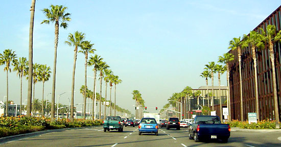
Figure 1
Take the palm tree, a familiar emblem of “sunny California.” An advertisement in a recent travel magazine [figure 1] bears the caption “Palms are Taller in Los Angeles.” Taller than in Florida, yes, but are they as ubiquitous as this ad implies? In his little photo book A Few Palm Trees (1971), Ed Ruscha painstakingly locates fourteen palms, shot by a camera facing west, at such intersections as “SW corner of McCadden Pl. and Yucca St,” but his palms look like toys, their black outlines silhouetted against the white space of the page rather than “growing” anywhere at all [figure 2].[4]
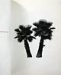
Figure 2
Like Stevens’s “Of Mere Being,” Ruscha’s A Few Palm Trees is thus best understood as conceptual art; it has less in common with Ruscha’s typical photo-books than with, say, Richard Neutra’s travel sketch Twenty-nine Palms, dated “Xmas 1938” [see figure 3],[5] an image of an oasis in the California desert as fanciful and abstract as Stevens’s “palm at the end of the mind,” “stand[ing] on the edge of space,” with the wind “mov[ing] slowly in the branches.” “You know then,” the poet declares mysteriously in the third tercet “that it is not the reason / That makes us happy or unhappy.” The syntax is ambiguous: is Stevens pointing at the “it” as “not the reason” for our happiness or unhappiness, or is he dismissing the rational faculty as irrelevant to our feelings? In either reading, the “edge of space” where the “gold-feathered bird” in the palm tree sings its “foreign song” is not an identifiable locale.
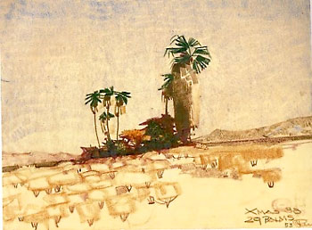
Figure 3
But what about a more “realistic” art, for example, the photo sequences of Ed Ruscha or Robbert Flick—sequences said to “document” the topography of the Los Angeles boulevard? In taking up the status of documentary art, we might begin with the representation of Los Angeles by architectural historians. In his well-known 1994 essay on Wilshire Boulevard, Thomas Hines details the history of this particular “Grand American Avenue” (the title of the book in which his essay appears) which, as he shows us, followed roughly the imprint of ancient animal and Indian paths and of Spanish explorers’ trails westward from the pueblo on the L.A. River to the Pacific Ocean.[6]
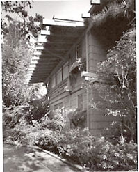
Figure 4
The brainchild of the colorful Gaylord Wilshire, an entrepreneur born in Cincinnati in 1895, who struck it rich first in citrus farming, then in real estate, and later became a socialist journalist, Wilshire Boulevard, completed in 1934, runs from Grand Avenue downtown to the ocean in Santa Monica, a dense linear strip of sixteen miles that became the early commercial hub of the city. In the course of his narrative, Hines alludes to the quintessential noir treatment of Wilshire in the 1940s novels of Raymond Chandler and discusses such Modernist landmarks as Greene & Greene’s beautiful Anthony House of 1909, later relocated to Beverly Hills [figure 4], and the Art Deco May Company (1940) at the corner of Wilshire and Fairfax [figure 5].
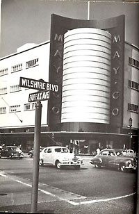
Figure 5
Interestingly, the Wilshire Boulevard of the ‘40s, with its astonishingly heavy downtown traffic [see figure 6], had little resemblance to the Miracle Mile [figure 7] or 5th-6th St preservation block in Santa Monica [figure 8] as we now know them. And, when we turn to an even earlier period, as in this typical picture postcard of the 1930s [figure 9], with its view East toward MacArthur Park, we note that the park’s thick greenery has a low profile—the opposite of tall palms — so as to provide an opening between the apartment houses and office buildings that frame it along this busy, colorful street.
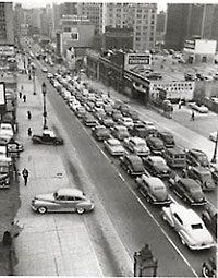
Figure 6
The architectural history of Wilshire—or at least of its representations — can certainly be documented as it is in Hines’s closely researched essay. But even Hines’s narrative is not merely neutral or impersonal: to read it is to note that the author of the first important studies of Richard Neutra and Irving Gill comes to Wilshire with a predilection for Modernism, in art and literature, as well as in architecture. His is thus an engaged reading of Los Angeles, as are, in very different ways, the sequential photographs of Ed Ruscha and Robbert Flick, to which I now turn.
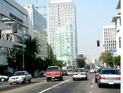
Figure 7
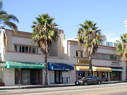
Figure 8
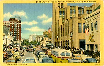
Figure 9
In 1966 Ed Ruscha attached a motorized camera to his car and drove up and down Sunset between Laurel Canyon Boulevard in West Hollywood and a few blocks beyond Doheny at the far end of the Sunset Strip, where Beverly Hills begins. The resulting “documentary” photomontage, a small accordion-shaped book of ordinary black-and-white snapshots, is called Every Building on the Sunset Strip [figures 10-11].
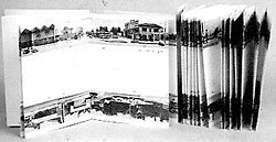
Figure 10
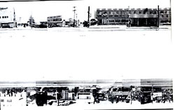
Figure 11
Some thirty years later, Robbert Flick created large-scale color photo collages [figure 12] of his own journey, this time with a digital video camera, from one end of Pico Boulevard to the other (together with similar studies of Wilshire, Santa Monica, and, most recently, Alameda and Central Avenue).
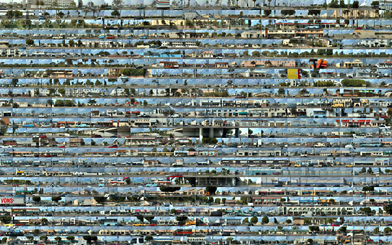
Figure 12
Flick’s Pico is very different from Ruscha’s Sunset. But both photo documentaries, I want to suggest here, present a complex tension between representational reference and compositional game.[7] The sequenced images are at once startlingly “real,” giving later generations a curiously potent sense of what the L.A. of the sixties and then the nineties was like. At the same time, these photo sequences void temporality so as to capture a particular moment—a moment, we shall see, as fictionalized as it is “real.”
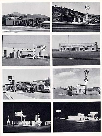
Figure 13
I foreground the question of fictionality because, in both cases, critics have focused almost exclusively on the mimetic contract between artist and designated subject matter. “Quintessentially Los Angeleno” the epithet Don Cameron applied to Ruscha’s work in a catalogue essay of 1990, has become a kind of mantra.[8] “Sometimes,” writes Pontus Hulten, “an artist reunites all the essential elements of the thinking and feeling that are current in his generation and in his environment in a very simple and pure way. . . . Ruscha is the great Californian even if he is born in Omaha, Nebraska.”[9] And Mark Stevens, reviewing the Whitney exhibition of 2004, declares:
Certain artists become a place. Canaletto is Venice. Constable is the English countryside. Homer is New England, and Hopper is Depression-era New York. Ed Ruscha is that kind of artist. He’s Los Angeles. . . Ruscha, more than any of his contemporaries, captures the peculiar presence of the city. Whenever I come upon a Ruscha, I am suddenly there, palpably there, as if I were about to turn on the radio, ease into the traffic on Santa Monica, and let the world float across my brain pan.[10]
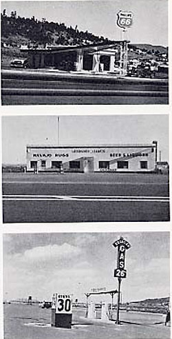
Figure 14
A more nuanced statement of this position may be found in Hal Foster’s review of the Whitney show for the London Review of Books. Foster describes Ruscha’s “sensibility” as “equal parts Midwest straight and California slick (dust and oranges) [that] regards the weird vernacular of postwar America as totally natural (gas stations as trees).” In the photo-books, beginning with Twentysix Gasoline Stations of 1963, (see figs. 13-14), and including Some Los Angeles Apartments (1965) and Every Building on the Sunset Strip, Ruscha, says Foster, “renders landscape as so much real estate, gridded and numbered as such. . . [The] dual focus on storefronts and billboards implies an automotive point of view, and the windscreen is indeed the unseen frame of many of his pictures.” Foster concludes:
In [Ruscha’s] pictures [see figures 17-20] the light is true and illusory at once, the hallucinated (or medicated) stuff of Hollywood dreams that offers [in Ruscha’s words] a ‘feeling of concrete immortality’. At the same time, Ruscha presents this dream-space as thin and fragile. . . and sometimes there is a hint of catastrophe, a sick glow beyond the usual smog, a touch of Nathaniel West or Joan Didion. Though he is a believer to the end, Ruscha suggests that Los Angeles might be a mirage and California a myth—a façade about to crumble into the desert, a set about to liquefy into the sea.”[11]
Quintessentially Angeleno in the vein of West and Didion: David Heathcote, discussing Richard D. Marshall’s recent book on Ruscha, The Myth-Maker of LA (Phaidon, 2005), invokes the same names along with Raymond Chandler and calls Ruscha’s 26 Gasoline Stations “a masterpiece of Californicity.” “Ruscha,” Heathcote writes, “has spent a lifetime working on the essence of Los Angeles, so much so that he has become part of it himself.”[12]

Figure 15
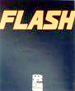
Figure 16
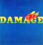
Figure 17
But does Los Angeles have an essence? The tension between “dreamscape” and “catastrophe,” between a “light . . .true and illusory at once,” emerging as a “sick glow beyond the usual smog”—may well be present in Ruscha’s work—and Foster captures the mood, especially of his word paintings, most acutely — but this is not to say that the ominous “hint of catastrophe” Foster speaks of is in any way equivalent to “Californicity.” Can the complexity and contradiction of Los Angeles be so easily contained? Is it the case that, as Foster claims, the signs in Ruscha’s now iconic word paintings of the early 60s –for example, SPAM! [figure 15] , FLASH [figure 16], DAMAGE [figure 17], or the famous Hollywood [figure 18] — imply that “such fetish-terms [may be] “the only public figures left to portray, the truly dominant features of the landscape”?
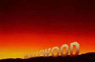
Figure 18
The iconicity of Los Angeles is assumed in theoretical discussions of Ruscha as well. In an important essay for October (1990), Benjamin Buchloch argues that Ruscha’s great contribution to Conceptual Art was the choice of “the vernacular (e.g. architecture) as referent,” the deployment of photography as “the representational medium,” and “a new form of distribution (e.g., the commercially produced book as opposed to the traditionally crafted livre d’artiste.” Buchloch reminds us that “reference to architecture in any form whatever would have been unthinkable in the context of American-type formalism and Abstract Expressionism . . . until the early 1960s.” Ruscha’s great contribution, in this transitional moment, was to take a “deadpan, anonymous, amateurish approach to photographic form,” an approach that accords with the artist’s choice of the “architectural banal.” The hierarchy of media, which even Andy Warhol had observed up to this point, was thus dismantled.[13]
The emphasis on the “architectural banal”, regularly equated with Los Angeles, was further developed in a subsequent issue of October (Winter 2005), featuring a whole section on Ruscha’s relationship to conceptual art, pop, word-image collocation, and the photo book. Jaleh Mansoor, for example, examines Every Building of the Sunset Strip as “an internally hybridized assemblage of camera, car, and road, which could investigate a new set of communicative potentialities”:
The recorded visual trace of this drive, a bandlike stretch structurally homologous With the extension of the Strip itself, positions our point of view as from the car’s passenger side. . . . The accordion format of the book, which suggests a temporal unfurling, mimics the sense of passage implicit in a drive. As the car rolls down the length of the street, it produces a serious of contiguous spaces horizontally aligned.
The two parallel bands produced by this process [see figures 10-11] are separated by a wide band of white, enhancing the flatness of the image. In splicing together the individual snapshots (some of them cut off and incomplete), Ruscha enhances the absence of all perspective: houses, gas stations, billboards, empty lots: all these unfold without comment. Every Building on the Sunset Strip manifests no trace of conscious authorial intention; indeed, Mansour notes, there is no evidence of any selection whatsoever, only a “bland facticity.” Ruscha’s Sunset Strip, she concludes, exemplifies what Buchloch calls the “aesthetics of indifference”: the “horizontality” of the book “functions as a repository for the unmediated recording of every bit of data on the Sunset Strip,” its two bands “dotted with the signage of consumerist abundance . . . traversable only by that urpostwar commodity: the car.”[14]
Subtle and detailed as is this reading of Ruscha’s photographic sequence, it takes us right back to Cameron’s or Stevens’s definition of Ruscha’s work as “quintessentially” Los Angeles, although for Buchloch and Mansour this epithet has a more negative thrust. When we look closely at the book itself, however, something rather different emerges—something reproduction cannot capture in the case of this small (c. 5 x 7”) paper-covered accordion-book, with its black-and-white snapshot images. Let me try to describe it for you here.
The upper band [figures 10-11] goes West on the South side of the boulevard from Schwab’s Pharmacy at 8024 Sunset (near Laurel Canyon Boulevard) to the Jaguar showroom at 9076. The lower band (one must turn the book upside-down to read it) goes East along the North side, covering the same stretch of Sunset Strip. Far from being equally non-evocative, these two bands present a distinct difference between the North and South sides of the boulevard. Looking North on Sunset, where the houses and shops are, on the whole, more affluent than on the South side, the viewer’s eye is led up the intersecting roads to vistas of the Hollywood Hills. King’s Road, for example, cuts steeply up to the mountains with attractive houses on either side, and at 8341 there is a beautiful modern house set back from Sunset above a driveway. At 8221 the Chateau Marmont is surrounded by a forest of greenery, and, in general, the north side still has many empty lots giving the viewer a sense of openness, recorded by angle shots that enhance their size.
The South side of Sunset is much drabber. Small-time schlock is everywhere in evidence, for instance in the image of the Plush Pup Motel at Havenhurst, set back from the street with the pool and umbrella area fronting on Sunset so that someone driving by can see the sunbathers in their bikinis through the chain-link fence. At Sweetzer, a huge sign reads “S[AVE 300 Dollars”; further along at #8920, a long low unidentified white building bears the single word “THE,” leaving the driver in suspense as to whether this is a funeral home, a restaurant, or something else. Rent-a-car places, body shops, and liquor stores predominate until we reach Sunset Plaza where, as is still the case today, the shops and restaurants are more upscale, including the BOOK WORM. The vista down La Cienega into the smog is as bleak as the one up King’s Row is pleasant. Near Doheny, there is a residential strip with large houses of somewhat faded elegance; beyond these, we come to SCANDIA (at that time one of the best restaurants in town, but with an ugly storefront, still there to this day) and finally a gas station and the Jaguar showroom, the fitting entrance to Beverly Hills.
Is this documentary photography? Yes and no. Ruscha’s book depicts a ‘60s Sunset Boulevard, still mainly made up of two- story buildings—banks, realty offices, dry cleaners, restaurants with pretentious names like VIA CONDOTTI and L’ANCIEN REGIME (these on the north side) and lots of open spaces. The one overtly Hollywood icon is the billboard: here bearing signage like THE RUSSIANS ARE COMING / THE RUSSIANS ARE COMING (in 1966, the film but perhaps also the real thing!) caddy-corner with an ad for “VINCENT EDWARD AT THE COPA.” There are few cars parked along the boulevard and virtually no pedestrians.
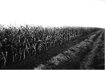
Figure 19
But if Every Building on the Sunset Strip is an “accurate” period piece, documenting the role topography (the hills on the North side, flats to the South) plays in architectural planning, it is, in another sense, a total fiction. The very use of black-and-white transforms the boulevard, sunny in daytime, brightly lit at night, into the dark, empty space of film noir. The focus on ugly corners and empty lots between buildings heightens the sense of dislocation of the overall image. And by limiting himself to the Strip itself, rather than taking in the Sunset Boulevard neighborhoods beyond, Ruscha gives us a noir Los Angeles that harks back to Double Indemnity rather than that to the exotic landscaping and eclectically colorful mansions of Beverly Hills or the glamorous entrance gates to Belair. Again, the confinement to the Strip means that the poor Latino neighborhoods on the other side of Hollywood play no part in Ruscha’s montage. This, then, is Ruscha’s Sunset, not an emblem of Los Angeles as a whole, much less of Californicity. Indeed, far from portraying L.A. as the “stuff of Hollywood dreams” or “consumerist abundance,” these pictures oddly transform the city into some sort of small town America with its Mom and Pop stores, Texaco stations, and its juxtaposition of newly constructed storefront and empty, weed-filled lot.
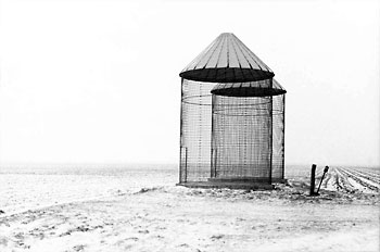
Figure 20
A similarly fictionality characterizes the later boulevard series of Robbert Flick. Since 1990, Flick, the Netherlands-born, Vancouver-bred artist, whose early work used Midwest landscape as its base [figures 19, 20], has been systematically documenting our boulevards—Hollywood, Wilshire, Santa Monica, Alameda — but especially the most nondescript and least celebrated of them all—Pico, in its extension from the ocean in Santa Monica to its terminus at Central Avenue downtown. Flick takes his pictures with a digital Hi8 video camera, mounted behind the driver’s seat of his car, pointed left and perpendicular to its forward motion. As Tim B. Wride explains it in his catalogue essay for the LACMA retrospective of 2004:
Flick records the experience of a single continuous drive along a preselected route, scouted on different days of the week and at different times of the day. . . . The resulting video is the raw material from which Flick fabricates his images. An intricate frame-by-frame selection process creates threads of visual interest. These threads are then joined together, digitally “woven” as it were, so as to present the entire experience of the trajectory as a conjoined series of individual images reading from left to right and progressing from top to bottom.[15]
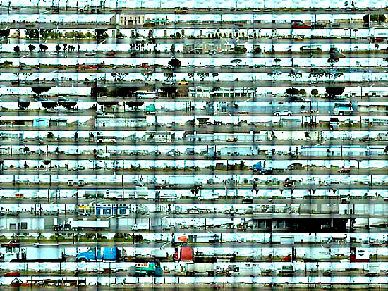
Figure 21
The large grids constructed from literally hundreds of individual frames look from a distance almost like abstract paintings: here [figure 21] is the 1997 Alameda A, a crystal print mounted to aluminum. And the “Along Pico” sequence of Ilfachrome prints [figures 12, 22-23] has become a signature piece of Flick’s work, appearing in varying guises in exhibitions and books, for example as an eight-page photo essay called “Along Pico Looking North” in the 1996 book Rethinking Los Angeles, put together by Michael J. Dear and others for Sage Publications. The recto and verso of the book’s cover also contains sections from “Along Pico.”
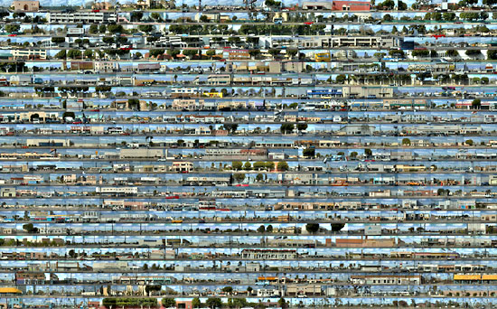
Figure 22
Like Ruscha’s photo sequences, Flick’s grids focus on the vernacular—serial images of Los Angeles boulevards as taken from a moving car; even more than Ruscha’s, they seem to provide literal documentation of the most mundane details of the urban landscape in all its dreary facticity. And perhaps because of this—I shall suggest quite superficial—similarity, Flick’s work is regularly said to depict the “real” Los Angeles. Thus David L. Ulin, in his LACMA catalogue essay, has a whole section called “How is the Photography of Robbert Flick like Los Angeles?” (LACMA 12), and after invoking, as do Ruscha’s admirers, the names of Nathaniel West and film noir, he answers his own question as follows: “What makes Flick’s work so fundamental to Los Angeles is its inherent tension between small and big picture, between the details of the street and the larger assembly of which it is a part” (LACMA 13). I’m not sure the same couldn’t be said for the representations of any number of other big cities today—Sydney or Chicago for starters—but here again is the desire to take the documentary photograph literally. In his interview with Flick, Michael Dear takes a similar tack:
“Robbert, the first time I saw your work, I immediately thought, ‘That’s it, that’s Los Angeles!’ That’s exactly how I see this city. From the street, and at speed, it’s a punctual, linear experience, not continuous as in a movie. The city is perceived essentially as an interrupted sequence. In addition, your photographs convey the flatness of the city, the absence of verticality in Los Angeles, its unidimensionality.[16]
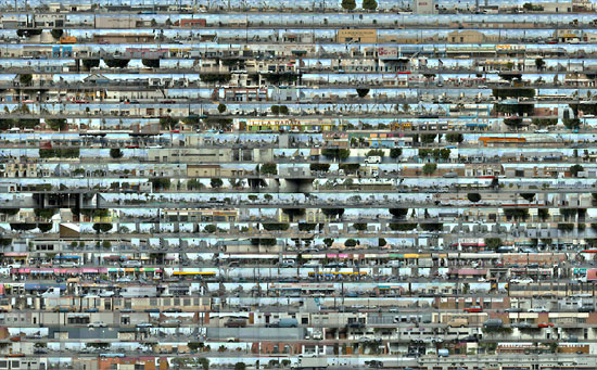
Figure 23
Flick agrees about the flatness, the open sky, and low horizon. But he is quick to insist that “You’ve got to start from the notion that a photograph is an illusion. . . . It is a fiction; it is a construction. . . . In a photograph, time is basically suspended or frozen, so the type of scrutiny that can take place is rather substantial.” And he further reminds Dear that our perception of photographs is “essentially electronic and governed by the way the media have affected our way of seeing” (Dear 18); the iconographic content of a photograph, as he explains it, has always already been subverted by the time we encounter it. And Flick goes on to describe his own particular selection process, the analysis of a given frame so as to create contexts for the adjacent ones. In the end, he remarks, with reference to his earlier “Midwest Diary,” “there’s a direct correlation between the edge of a cornfield and the edge of a street” (Dear 20; see figure 19).
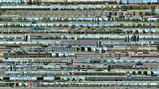
Figure 24
When Ruscha talks of “every building” on the Sunset Strip, he means every building in sequence, however much individual angles may be varied and distorted. But for a digital artist like Flick, sequence need no longer be adhered to; on the contrary, the individual frames, laid out on the computer, can be arranged so as to reconstruct a given sequence almost entirely, thus fulfilling the artist’s desire to use documentary evidence to create his own aesthetic construct. Consider the following detail from the large recent photo piece “From Wilshire to Highland” [figures 24-25].

Figure 25
The frames in question appear in the ninth and tenth rows [see figure 32] of the larger grid—a grid which presents Wilshire as a surrealistic streamlined set of bands, whose images of built environment (long and low) are interspersed with images of trees and shrubs against a perfect blue sky, and then a strip mall with a series of shops, an enormous fortress-like Staples, followed by photographs of the sign “HIS & HER HAIR on a small beauty shop. In the detail, this HIS & HER frame is spliced so as to double over and repeat itself three times, each time with a different representation of the lettering itself. On the street below, the large gray car is cropped and reappears in part in the next frame, even as the dark blue-green sedan next to it is cropped, revealing another car, this time pictured as if on the sidewalk behind it. In the row below, in front of the amorphous Modernist Customer Service Center (service precisely for what?) in a double appearance between traffic-light columns and boulevards, there is the image of a dark man, dressed in white, with a white sun hat, standing beside his cart of oranges. In the context of asphalt, car parts, the oval windowless Service Center, and the ugly telephone and lamp posts, this image is radiantly beautiful. It makes me think of Frank O’Hara’s poem “Oranges,” which became the subject of a collaboration with Grace Hartigan: orange was always O’Hara’s favorite color, lighting up the city like an interlocking set of suns. It gives a new aura to the single pedestrian, a woman in shadow, perhaps emerging from the HIS & HER HAIR parlor or again perhaps from its competitor PRECIOUS HAIR & NAILS, a cheaper facility evidently, where one can get a color weave for $12.95, according to the sign on the window. Then too, the whole block, ugly as these little buildings are, has an aqua blue awning that forms a horizontal line across the whole frame.
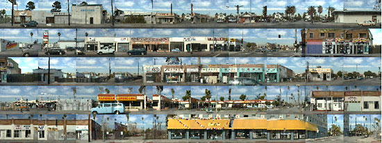
Figure 26
The juxtaposition of beige tenements with black window holes (the sequence looks like a train) and the more up-to-date Security Service Center, with its oval shape, and of both with the blue sky, open boulevard and the isolated figure selling oranges makes for a semi-abstract composition that recalls Edward Hopper or Lionel Feininger more than it recalls a Ruscha or Warhol. And indeed, in the digital version of the Pico sequence, found at Flick’s Ghost Trajectories website,[17], the grid “Broadway to Los Angeles” [figure 27] suggests, Flick’s loving images of pink, blue, and yellow awnings, confronting the fairly cheap signage one expects on this downtown stretch of Pico, reminds the viewer of nothing so much as the little patch of yellow wall in Vermeer’s View of Delft that haunts Swann in Proust’s A La Recherche (cf. the orange awning in “Windsor to Third” in the same series, figure 28]). Here the surreal cars—four times their actual size or cut in half or climbing the sidewalk between frames, or bumping into one another — create dreamlike contrasts with signs like “MAYOREO WHOLESALE” (one sign, evidently, on top of another older one or perhaps someone has painted the word “oreo” over a MAY COMPANY or MAYOR sign) “MIMI KIDS,” and the “NEW YORK LOOK.” The man in the fourth row from the top, carrying a huge carton from #209, looks as if he will be trapped between two silhouettes of the same black sedan; a second man, dressed in different colors, carries exactly the same kind of carton in the opposite direction in front of #211. We are in the garment district in the heart of seedy downtown.
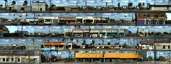
Figure 27
An obvious thing to say about Flick’s Pico images—and here the digital sequence captures detail more fully than can the framed photograph — is that the signage appears in the languages now spoken in L.A.—Hebrew, Arabic, Spanish, Korean, Vietnamese, Chinese—as well as English. Tiny textual details are juxtaposed to fantasy images, as in the “Livonia to Bedford” sequence [figure 29], where the Persian sign above the words “KOSHER MARKET” –L.A. has a large Iranian Jewish community — seems to fall under the weight of those absurdly gabled houses above it. And the podiatrist whose sign is up at #6711 may be an exemplar of the sign on the bus, “Doctors that can make you feel good about your HMO.” Or again, as the three juxtaposed cars (the same car?) in front of the podiatrist’s office suggest, one enters this particular doctor’s quarters at one’s peril.
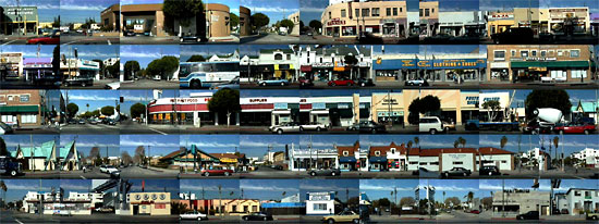
Figure 28
Flick’s close-ups, consciously or not, view Los Angeles street scenes through the prism of Dutch genre painting. Yet whereas Gerard Ter Borch or Peter de Hooch paint primarily interiors (as does, of course, Vermeer), Flick refuses to violate the façade, the complex, layered surfaces that point, but only obliquely, to a possible life behind them. Unpeopled as his sequences seem to be, they have an emotional charge quite different in affect from the flatly articulated Ed Ruscha gasoline stations and apartment houses. The opacity of Flick’s visual universe, its use of color field, abstraction, fragmentation, and especially repetition to create density and overlay, construct a Los Angeles quite different from Ruscha’s modest journey along a black-and-white Strip, a Strip, incidentally, all but bereft of other cars, whereas Flick’s more recent digital landscape is comprised of large dream- mobiles, seen primarily in pieces. Indeed, these sequences suggest, one cannot any longer see the vista whole, no matter how attentive one is. “The palm,” as Stevens knew, “stands on the edge of space. / The wind moves slowly in the branches.” But what may come up around the corner is anyone’s guess. “Californicity,” it seems, comes in many guises.
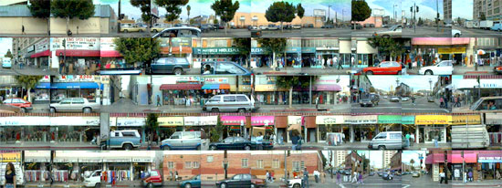
Figure 29
Notes
[1] Wallace Stevens, The Palm at the End of the Mind: Selected Poems and a Play, ed. Holly Stevens (New York: Alfred A. Knopf, 1984), p. 398.
[2] Reyner Banham, Los Angeles: The Architecture of Four Ecologies (1971; Berkeley and Los Angeles: University of California Press, 2000).
[3] Douglas Suisman, Los Angeles Boulevard (Los Angeles: Los Angeles Forum for Architecture and Urban Design, 1989), p. 7.
[4] Edward Ruscha, A Few Palm Trees (Los Angeles: Heavy Industry Publications, 1971).
[5] Thomas Hines, Richard Neutra and the Search for Modern Architecture (1982; New York: Rizzoli, 2005), p. 206
[6] See Thomas S. Hines, “Wilshire Boulevard,” in The Grand American Avenue 1850-1920, ed. Jan Cigliano, Sarah Bradford Laundau (San Francisco: Pomegranate Artbooks 1994): 307-37.
[7] The phrase is David Antin’s: see “Some Questions of Postmodernism,” Occident
[8] Don Cameron, “Love in Ruins,” Edward Ruscha, ed. Elbrig de Groot, Touring Exhibition (Rotterdam: Museum Boymans-van Beuningen,1990), p. 13.
[9] “Writing on a Picture,” Edward Ruscha 23.
[10] Mark Stevens, “California Dreaming,” New York: The Magazine, 9 August 2004: www.newyorkmetro.com/nymetro/arts/art/reviews/9565
[11] Hal Foster, “At the Whitney,” London Review of Books, 26, no. 17 (2 September 2004): www.lrb.co.uk/v26/n17/print/fost01
[12] David Heathcote, review of Richard D. Marshall, The myth-maker of LA,” Eye Review 53 (Autumn 2004): http://www.eyemagazine.com/
[13] Benjamin H. D. Buchloch, “Conceptual Art 1962-1969: From the Aesthetic of Administration to the Critique of Institutions,” October 55 (Winter 1990): 105-43; see pp. 119-22.
[14] Jaleh Mansour, “Ed Ruscha’s One-Way Street,” October 111 (Winter 2005): 127-42; see pp. 130-33.
[15] Tim Wride, “Trajectories: The Photographic Work of Robbert Flick,” in Robbert Flick, Trajectories (Los Angeles County Museum of Art/Steidl Verlag,2004), p. 22. Subsequently cited as LACMA.
[16] “Representing Los Angeles: Robbert Flick in Conversation with Michael Dear,’ Rethinking Los Angeles, ed. Michael J. Dear, H. Eric Schockman, Greg Hise (Los Angeles: Sage Publications, 1996), p. 17.
[17] See Robbert Flick, Ghost Trajectories http://finearts.usc.edu/ghost_trajectories/index2.cfm, Sequential Views
it is made available here without charge for personal use only, and it may not be
stored, displayed, published, reproduced, or used for any other purpose
This material is copyright © Marjorie Perloff and Jacket magazine 2006
The Internet address of this page is
http://jacketmagazine.com/30/perloff-palms.html
