 Jacket 31 Contents page
Jacket Homepage
Jacket 31 Contents page
Jacket Homepage
Robert Creeley feature
Contents list
This piece is about 25 printed pages long.
Form is the possibility of structure.
—Ludwig Wittgenstein
Form is never more than an extension of content.
—Robert Creeley
Nor did Gutenberg himself invent a new law of form.
—Jan Tschichold
It seems as if Creeley was always working on a book – either through his various roles as an editor and publisher, writing blurbs for others, or checking proofs of his own poetry, essays, prose, and interviews. He worked with various commercial publishing houses, hundreds of small presses and magazines, and late in his life, was a strong proponent of electronic and multimedia publications. It wasn’t unusual for a poem to appear in multiple publications. For example, “I Know A Man” appears in: For Love, a conceptual letterpress pamphlet produced by Alex Finlay, several compact disks (including the Rockdrill anthology), a broadside published by C. Hartman of Providence, R.I., hundreds of websites (in both visual and audio formats), essays by Charles Altieri, Cid Corman, Michael Davidson (and others), The Collected Poems 1945-1975, and dozens of anthologies. Although the text remains relatively stable in each permutation of the poem’s reproduction, the visual elements crucial to this poem in particular, undergo a great deal of variation. Although I don’t think that the question of variants in canonical Creeley poems is as complex as those of his predecessors Emily Dickinson and Walt Whitman, the typographic dimension of his work is nevertheless crucial to figuring the poem as a visual and spatial “occasion” in time – one that brings biography and bibliography into dialogue with one another.
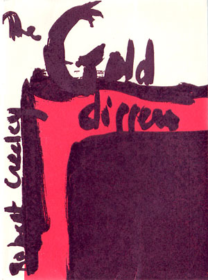
The Gold Diggers, cover
When I interviewed fellow Black Mountain College alumnus Will Hamlin, he told me about his work at the campus print shop where he had learned typesetting from Joseph Albers. He recalled, “[Albers] hated periods after abbreviations because they called attention to themselves and were always too black.” He retrieved a pamphlet he had printed by hand for a student production of Chekhov’s The Cherry Orchard shortly after the College moved to the Lake Eden Campus in the late 30s. The experience was as simple, beautiful and authenticating as the object itself. I remember building up the letters of William Carlos Williams’ “A poem is a small (or large) machine made of words” early on. Hamlin remembered Annie Albers’ astonishment when she arrived at the College and saw a photograph thumb-tacked to the huge Doric columns outside Lee Hall (a friend later explained that they were made of wood). John Andrew Rice, rector of BMC before Olson, had no intention of starting an art school, but knew that the arts had to be at the center of the curriculum. As the Nazis’ reign became intolerably severe, the Bauhaus, marked as a center for radical thought, was forced to close its doors. It was Philip C. Johnson at the Museum of Modern Art who had met the Albers a few years earlier in Berlin, who subsequently put Rice in touch. Ted Dreier described the College as a “pioneering adventure,” which was enough to convince the young couple that they might find likeminded teachers and artists in the remote foothills of North Carolina.
The First and Second World War were the approximate bookends of Creeley’s youth, a time when an emerging generation of typographers could no longer accept the antiquated serifs and central axis composition established by Jenson, Bodoni, and Didot. Overhaul of outmoded systems were desperately needed to express the moods, thoughts, and symbolic powers of the times. How could one use German Fraktur, for example, without pointing to the history, ideology, and dogma of Nazi Germany?
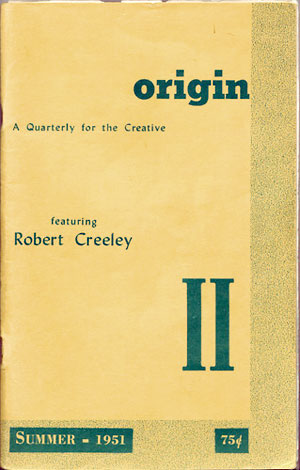
Origin magazine, Summer 1951, cover
As a student at Harvard in the early 40s, Creeley helped edit a special issue of the Harvard Wake, dedicated to the work of painter and poet e.e. cummings, whose poems often remind me of Eric Gill’s assertion that “letters are things, not pictures of things.” Later, raising chickens on a farm in Littleton, New Hampshire, he heard, “… through a fluke of airwaves” Cid Corman’s “This is Poetry,” a weekly radio program broadcast out of Boston. Creeley got in touch with Corman in 1950, who invited him to read on the program one weekend when he was to attend a poultry show in the city. So began the weave of correspondence that led to the first issues of Origin, the Black Mountain Review, and the establishment of his own Divers Press. Creeley explained: “A knows B, B knows C, and there begins to be increasing focus. And I think that we were curiously lucky that that focus was not literally a question of whether we were living together or not.” It’s often occurred to me that one of the great advantages my friendships with poets has over the painters is that we can easily keep up on each other’s work even when we’re not living in close proximity to one another.
A great traveler, Creeley nevertheless lived much of his life in remote areas. Like many young poets, he began corresponding with his significant peers and elders when he invited them to contribute work to a magazine. His first experience as a printer came rather unexpectedly: “I had tried to start a magazine with the help of a college friend, Jacob Leed. He was living in Lititz, Pennsylvania, and had an old George Washington handpress. It was on that that we proposed to print the magazine. Then, at an unhappily critical moment, he broke his arm, I came running from New Hampshire – but after a full day’s labor we found we had set only two pages, each with a single poem. So that was that.” The magazine never materialized, and he eventually gave Corman the work he had collected, including poems by Levertov, Blackburn, Olson, and his own “Hart Crane” for the first issue of Origin. Their dispute over the material aesthetic of the first issue serves as a particularly insightful rift because it sets the stage for the charged debates between the private press old garde and the no-frills DIY aesthetic of d.a. levy – letterforms are nothing if not controversial.
In the early fifties, when letterpress printing was not entirely obsolete but certainly on the decline, Corman felt that it was pretentious, and opted for a combination of varitype and photo offset printing, much to Creeley’s dismay.[*] Although Corman felt that the first issue was “no marvel of printing,” its reception was more than favorable:
Vincent Ferrini, whom Cid had gone to join in Gloucester to celebrate the occasion, was thrilled. Olson, whose contributions claimed the bulk of the issue, was ecstatic. To read the magazine had given him the fullest satisfaction he’d ever had from print. However, the most exuberant praise, first by telegram of 20 April, then by letter, came from the man who had but a single poem in the issue. It was a very fine job, Creeley admitted, clean, wonderfully flexible, and altogether without pretension.
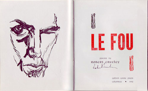
Le Fou, title page. Frontispiece drawing by Ashley Bryan.
Creeley’s first book of poems, Le Fou (1952), is intriguing in every sense. The text was handset by Frederick Eckman in collaboration with designer Richard Wirtz Emerson at the Golden Goose Press in Columbus, Ohio. The book itself is a charming combination of typographic styles, classic Garamond and Libra, a revival of uncial (a majuscule script) designed by the 19th century Dutch typographer S.H. De Roos. Based on the manuscripts of Latin and Greek scribes, from the 8th century on, uncial script was primarily used for headings, as in the title page above. The black and red vegetative marks frame the sans serif woodtype on the title page, complementing the organic lines of the hand lettering on the cover, as well as the shocking drawing of the author on the facing verso.
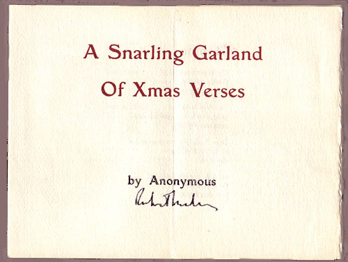
Snarling Garland, title page
According to Alastair Johnston, “Creeley’s wife felt he had squandered money on publishing. Ironically most of the titles fetch upwards of $200 today. Some years later, in fact, Creeley had the satisfaction of being asked to sign copies of his Divers titles for his by-then ex-wife to sell!” In 2005, a signed copy of Creeley’s “A Snarling Garland of Xmas Verses” sold for $3,500. It was printed on scrap paper.
With the financial support of his wife Ann, Creeley later established Divers Press in Palma de Mallorca with the publication of Martin Seymour-Smith’s All Devils Fading (1953). Mallorca was also the home of Robert Graves and Laura Riding Jackson’s Seizin Press, established in 1927. Like Virginia and Leonard Woolf’s Hogarth Press, Seizin and Divers were presses run by serious writers devoted to advancing the best contemporary writing as they understood it. The Woolfs established Hogarth twenty years before Seizin, and Divers produced their first book fifty-one years later. For the Woolfs, the Press began as a form of recreation, perhaps something of a therapeutic diversion from the pressures of writing – as articulated by Virginia. They had a small handpress in the dining room of their home, the Hogarth House in Richmond, Surrey. The unanticipated success of Virginia’s Kew Gardens (1919) encouraged them to turn Hogarth into a publishing enterprise, and they initiated a program based on their personal vision, brought out new works by writers who are, a century later, moderately well known to canonical. These include Katherine Mansfield, T.S. Eliot, Clive Bell, C. Day Lewis, Robert Graves, E.M. Forster, Christopher Isherwood, John Maynard Keynes, William Plomer, Vita Sackville-West, and, of course, Hogarth’s esteemed proprietors.
Using an Albion hand press set up at 35a St. Peters Square, Hammersmith, Seizin produced and published Riding’s, Love as Death, Death as Death (1928), Gertrude Stein’s An Acquaintance with Description the following year, and Graves’ Poems the year after that. Their intention was “To print necessary books by various particular people. Our editions are decidedly not addressed to collectors but to those interested in work rather than printing – of a certain quality. That is as far in prophecy as we care at the moment to go. You must take our word for it that our reticence is due to something more than an uncertainty of standards. Quite the contrary.” In 1930, they moved their press to Deya, Majorca and continued printing until the Spanish Civil War broke out. They were still living on the island when the Creeleys arrived. Graves (or Señor Grah-ways as everyone knew him) wasn’t discouraging of the young Divers, but wasn’t impressed either. They kept their distance.
From the north side of the island the carts began the journey into the city. The line of them wavered as it climbed in the blackness of the night, up the turning road of the hill in half circles, swinging in the darkness back and forth, slowly, up and up as their lights faded also with only the slurring wash of the sea and a donkey, left high on the hill, to break the quiet.
—Robert Creeley, The Island
Creeley met the English poet Martin Seymour-Smith through John Sankey’s magazine The Window when he expressed enthusiasm for All Devils Fading. Seymour-Smith and his wife were living in Mallorca at the time and arranged for a rendezvous in France. Their meeting is described in Creeley’s novel The Island when the characters Artie and Marge are introduced. It was about that time that Creeley was introduced to the works of the Abstract Expressionist and was particularly moved by the painting of Jackson Pollock, which he saw at Paul Fachetti’s gallery. There was an immediate discussion about starting a press together, and they actually published a collection of Seymour-Smith’s mother’s poems under the impression of the Roebuck Press before Creeley realized that their interests were too disparate for their newfound partnership to last.
Expatriate artists, such as Arthur Okamura, John Altoon, and René Laubiès made visits to the island where they created illustrations for Divers Press books. Runs ranged from two to three hundred copies, and the cheap labor and materials afforded Creeley the opportunity to give away copies, or sell them for 75 cents. The two most sought after books today are Paul Blackburn’s Proensa, translations from the Troubadour poets, and Charles Olson’s correspondence with Creeley from the Yucatan, Mayan Letters. Blackburn’s Proensa was set in Bodoni, a family of type based on the work of Giambattista Bodoni, an eighteenth-century Italian master printer credited with originating the style of letter known as “modern.” Bodoni yields a discernable mechanical perfection of form and more severe contrast between thick and thin strokes than traditional faces. In an interview conducted by Alastair Johnston while driving from Berkeley to San Rafael in 1980, Creeley discussed the printing of Proensa: “I remember the printers were fascinated with it because they could read the Provençal: the Majorquin was very close. There were some old-timers in there. Guasp, for example, I think was possibly the most continuous printing establishment in Europe, since the Renaissance. That part of it became delicious. It seems to me we could produce a book for… Proensa cost between 3 & 400 dollars, which was something then. The same book today would cost $1500. So then we really got into it.”
The other Divers Press books, including the Black Mountain Review and Charles Olson’s In Cold Hell, In Thicket (published as Origin #8) were set in Mossén Alcover’s house fount, Mercedes, an unusual but suitable indigenous face. The most peculiar book Creeley published was on pigeon breeding by the journalist and bird aficionado, H.R. Macklin, whose columns on obscure breeds of pigeons were then a regular feature in the American Pigeon Journal. At Creeley’s request, Macklin happily supplied A Handbook for Pigeon Fanciers, complete with his own drawings. In 1982, Creeley recalled the serious, edgy nature of the press: “I don’t recall that the Divers Press paid anybody anything – it was my wife’s modest income that kept any of it going – and so our choices had to be limited to writers as existentially defined as ourselves.”
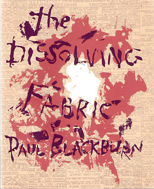
Dissolving Fabric, cover
Blackburn’s Dissolving Fabric has one of the most striking covers of all Divers’ books. It was designed by musician and painter Dan Rice, and Arthur Okamura did the silk-screen reproductions. Okamura’s opaque ink rests against an upside-down newspaper classified – possibly “dead matter,” or what printer’s call the standing forme from an old job. The contrast is striking. The classified columns make an orderly grid punctuated by headlines such as, “SALESMAN: FROZEN FISH,” “FANNING AGCY” and “CIVIL PARTY CHIEF.” The middle ground is an abstract splatter-dab of brown and white, while the title is painted in De Kooningish lettering. Divers also published early books by Larry Eigner (From the Sustaining Air) and Robert Duncan’s (Caesar’s Gate). In 1954, Creeley issued a volume of poems by Canadian poet Irving Layton and Japanese poet Katué Kitasono’s self-translated poems, Black Rain. The latter is set in Menhart, has a horizontal orientation, stiff Indian handmade paper wraps, and colorful geometric illustrations by the author that make it come closer to what we might think of today as an “artist’s book” (the term didn’t exist at that time) than the others.
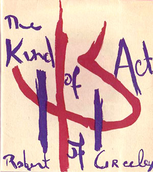
The Kind of Act of, cover
Creeley published his second book of poems, The Kind of Act of (1953), in a format just a bit smaller than The Dissolving Fabric. It was printed four-up in Futura and Mercedes, and folded into quartos. He also published his first collection of short stories, The Gold Diggers (1954); “I published my volume The Gold Diggers after I’d stupidly mistaken Alex Trocchi’s – and the Merlin people’s – real interest in the book, and I thought they were just being nice to me so I refused their generous offer of publication and we published it ourselves.”
He recalled his exchange with the printers, “I remember trying to reproduce the drawing for the cover of The Gold Diggers, which has the drawing of Laubiès’. There’s a red background, the red kept bleeding through, but they overprinted at least twice. Their shop was down from the central plaza, going along the sea wall. There was a beautiful prospect. They used to keep the back door of the shop open to get this lovely breeze. Extremely good natured. They were extraordinarily patient.” The book is a comfort to hold, just a little larger than pocketsize. The headings were set in Futura, a graceful and rhythmical sans serif designed by Paul Renner — ideal for extensive text — while the text was set in Bodoni, whose revivals maintain the abrupt hairline serifs, vertical axis, and small aperture – quintessential postmodernism. The color of the page is light because the full justification of the text combined with minimal hyphenation makes the kerning (the horizontal negative space) unusually wide. Given that the printers were working in a foreign language, I would guess that they were often uncertain how to properly break words down into syllables. An errata sheet tucked into the book notes twenty-six corrections, some of which “seriously damaged the meaning of the sentences.”
The last volume he published, in 1955, was an unsolicited work by American novelist Douglass Woolf entitled The Hypocritic Days: which, “… came out of the blue, that was great. I thought it was terrific. Also we’d been wanting to publish some prose.” The title of Woolf’s first book refers to Emerson’s poem “Days”: “Daughters of time, the hypocritic Days/Muffled and dumb like barefoot dervishes… ” The size and format is similar to The Gold Diggers, but the text, set in Mercedes, makes for a slightly darker page and the kerning is much improved. Reflecting on Alcover and his employees, Creeley wrote, “Their patience and ability to stay with us through our own sort of inchoate attempts to resolve design work were terrific. And they had such a physically clear sense of what a page could look like and so – their sense of spacing was so graceful – they could do any kind of text and give it that very comfortable feel of words progressing. Just delicious.”
He was still living on the island of Majorca in 1953 when the faculty at Black Mountain College agreed to appoint him editor of the Review. He had been to the College momentarily in 1944, but had yet to meet Charles Olson in person: “What I felt was the purpose of the press has much to do with my initial sense of the magazine also. For me, the other writers who came to be involved, it was a place defined by our own activity and accomplished together by ourselves – a place wherein we might make evident what we, as writers, had found to be significant, both for ourselves and for that world – no doubt often vague to us indeed – we hoped our writing might enter.”
It is worth repeating the fact that the configuration of writers in the Black Mountain College section of Donald Allen’s The New American Poetry (1960) had a stronger connection to the periodicals Origin and the Black Mountain Review than they did to the College itself. Interpreting Pound’s advice, Creeley thought of the Review “… as a center around which, ‘not a box within which/any item… ’” could appear. The Review had a group of regular contributors, while Creeley made a point of introducing emerging and little known writers to insure that (again akin to Pound’s dictum) each issue would consist of a constant and a variant.
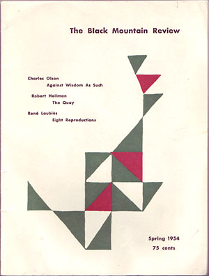
Black Mountain Review, cover, Spring 1954
Among the early “constants” were Levertov, Olson, Layton, Duncan, Carroll, Blackburn, Eigner, and himself. Olson understood the potential of the writers with whom he was in correspondence, and hoped that a revolutionary publication would attract the kinds of students he was looking for, and by default, bring in the tuition that the College (which had run on a shoestring budget since its inception) needed desperately. It was a gamble, but Olson convinced the faculty to commit $400-$500 per issue to the Review (printed in runs of 400-500), adding about $2,000 to their annual expenses. Creeley remembers: “Whatever the cause – and no doubt it involves too little the fact that all experimental colleges faced a very marked apathy during the fifties – some other means of finding and interesting prospective students had to be managed, and so it was that Charles Olson, then rector of the college, proposed to the other faculty members that a magazine might prove a more active advertisement for the nature and form of the college’s program than the kind of announcements they had been depending upon.”
Blackburn, Layton, Olson, and Rexroth were all contributing editors when the Review made its début in the spring of 1954 with Olson’s “On First Looking Out Through Juan de la Costa’s Eyes” kicking it off. It also featured poems by Creeley, Blackburn, Layton, and Eigner; Creeley’s introduction to eight reproductions of paintings by René Laubiès and prose by William Bronk, Robert Hellman, and Mason Jordon Mason. Jonathan Williams sold copies on the road with his Jargon Society books and Blackburn distributed them in New York City. Following Laubiès, Philip Guston, Harry Callahan, Jess Collins, Franz Kline and Aaron Siskind were each featured in specific issues, usually accompanied by a brief “note” by the editor, whose friendships and collaborations with the artists of these early years (often) sustained three generations. Creeley’s superb editing brought a contextual force to the handsome Review, modestly and affordably printed letterpress by the same jobbing firm in Palma de Mallorca that produced the books he published under the sign of his own Divers Press. Apparently Alcover couldn’t read a word of English, but patiently matched one letterform to another, building up the words in his composing stick. Creeley elaborates: “Louis Ripoll is the actual name, a sweet man, ran Mossén Alcover’s as shop foreman. Just incredible, in those days it was actually cheaper to handset than it was to use Linotype because the machinery was such an awful expense initially. He was a job printer who did newspapers and any kind of work that came along. Again, they were incredibly careful with their type fonts and literally picked through and kept reusing every single piece of type. The books I remember most vividly are Katsué Kitasono Black Rain, Olson’s Mayan Letters, for which Ann copied the glyphs freehand… ”[†]
The covers for the first four issues were designed by Kitasono and John Altoon, and Edward Corbett and Dan Rice worked on the last three issues. The College closed in the spring of 1956, and Williams became the publisher of the final issue. Allen Ginsberg (whose poem “America” appeared there for the first time) became the contributing editor and published “Book III” from “William Lee’s” (Burroughs’) Naked Lunch. Creeley moved from the rural South to the arid Southwest, and his proximity to the West Coast poets (as well as Ginsberg’s presence) is reflected in the selection of writers whose works were introduced in the seventh issue: Jack Kerouac, Gary Snyder, Phillip Whalen, Edward Dorn, and Michael McClure among them.
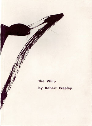
The Whip, cover
Gael Turnbull recalled that when he began Migrant Books in, “… the summer of 1957, I published The Whip, a small volume of selected poems by Robert Creeley, who arranged and managed the printing for me on Mallorca” (again with Alcover). There were 500 copies in paper wrappers and 100 hard cover. He explained, “… the bulk of the edition went out through Jargon in the United States. (I did have the intention of publishing Olson’s O’Ryan Poems but I didn’t get further than ‘an intention’ because I never got myself together enough to actually approach a printer in Worcester.)”
The Jargon Society did not begin with Olson’s mighty Maximus Poems, but with a much more modest project. Before heading south to Black Mountain College from Chicago, Jonathan Williams went to San Francisco where he met elders Patchen, Duncan, Rexroth, and Miller. It was there that he and David Ruff (who also worked for Ferlinghetti) collaborated on a small yellow handbill dedicated to Yee Jun, “… whose inspiration (gai lan yuke, gai lan char shiu, t’au fu, wonton, bitter melon, black beans and beef) led to the first issue of JARGON.” Ruff made the copper plates, Williams wrote a Patchenesque poem, and it was printed from handset Lydian type on 25 June 1951 in an edition of fifty. While the Jargon Society may forever be marked by Williams’ brief time at Black Mountain College, over the course of the last fifty-five years, “the will to change,” as Olson put it, is what has not changed. The range of artists and writers commissioned by Williams is staggering.
Like Duncan, Williams also cherished the library of his childhood. His father was also a poet with a lifelong interest in dialect and the vernacular. He read Uncle Remus, Porgy and John Charles McNeill’s Lyrics from Cottonland to him as a child. Local lore and the folk traditions are as much a part of Jargon’s evolution as the international avant-garde. When he was coming of age, his affinity for writers like H.P. Lovecraft and August Derleth brought him to Ben Abramson’s Argus Bookshop where he became acquainted with the poets James Laughlin was publishing through New Directions. In 1947, he left his elite secondary school where he worked as the editor of the school newspaper and served as captain of the tennis team, to attend Princeton University. He learned of Patchen’s illness from Henry Miller’s pamphlet Patchen, Man of Anger and Light and decided to get in touch with Laughlin, who subsequently put him in touch with Patchen. Williams offered to work as a typist for the ailing poet, who much his delight, accepted. He spent six weeks with Patchen and his wife Miriam at their home in Old Lyme, Connecticut. Patchen would dictate from bed, and Williams would transcribe for five or six hours a day. That manuscript, Fables and Other Little Tales, became the first substantial book published by the Jargon Society. Creeley’s mixed review of this book appeared in the Spring issue of the BMR (1954).
All That is Lovely in Men, cover
Persuaded to some degree by Patchen, Jonathan Williams quickly tired of his academic surroundings, and in his sophomore year went to Greenwich Village to learn etching, engraving, and printmaking. With a background in painting and a love of Blake, Miller, Lear, Carroll, and Mallarmé, he was already attuned to the visual qualities of poetry when he went to the Chicago Institute of Technology to study typography, etching and photography. It was there that he met Paul Ellsworth, a painter with whom he collaborated on several broadsides, and experimented with the possibilities of word and image combinations in the spring of 1951. At the time, the Institute of Design was a home for Jewish and European refugees. Hungarian-born painter, designer, photographer, and theorist Lázló Moholy-Nagy of the Bauhaus was the director. Williams studied typography under Lorna Zerner, who had worked directly with Jan Tschichold in Germany. Among Tschichold’s many contributions to modern design is his manifesto Die neue Typographie (1928; translated into English in 1945), in which he condemned all fonts but sans serif (‘Grotesk’ in Germany), and supported asymmetrical and non-centered design. Potter and translator M.C. Richards came to the Institute from Black Mountain to encourage students to enroll in a school known as a haven for “free love, communism, and nigger-lovers.”
Still disgruntled with student life in the windy city, photography professor Harry Callahan advised Williams to get in touch with his friend Aaron Siskind from New York who would be teaching (with Callahan) at Black Mountain throughout the summer session of 1951. Williams enrolled in their course, the climate agreed with him, and he signed on for the autumn semester to begin his studies when his aspirations were suddenly cut short by the draft. In the short time that he was at Black Mountain before his service in the military began, Williams was encouraged by Olson to integrate his talents as a writer, photographer, and designer. Using the printing press on campus, he published the works of other students at the college, including Oppenheimer and Rauschenberg’s collaborative broadside “The Dancer,” his collaboration with Ellsworth (who is credited for inspiring the Society’s name) and other student works by Dan Rice and Victor Kalos. Fielding Dawson, John Wieners and Francine du Plessix Gray were also his classmates.
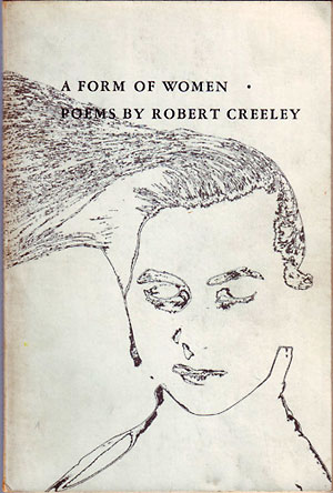
A Form of Women, cover
Ed Dorn was running the print shop: “When I went to Black Mountain I didn’t have any aesthetic values. I was a work-scholarship student. I had learned how to print, working on the hometown newspaper, and so part of the possibility of my being there was that I could run the Black Mountain printing shop. It was a small shop and they did their own programs for dances and a little bit of poetry.”
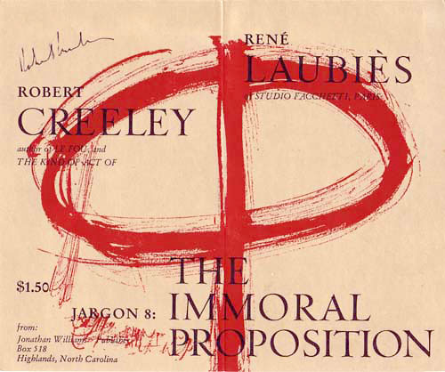
After numerous attempts to gain conscientious objector status, Williams was faced with serving a five-year sentence in jail or joining the army. With the help of a Jewish chaplain, Williams was transferred from his original post at a rifle company in Fort Knox, Kentucky to a hospital in Stuttgart – not too far from Mainz, where printing from moveable type was refined about 450 years earlier. When he arrived, he looked up the address of a printer in the city who had worked for Laughlin. After receiving a small inheritance from his friend Charles Neal, Williams took Jargon to the next level. Dr. Walter Cantz owned a print shop just around the corner from the hospital, and Williams’ low-key duties allowed him adequate time to begin working with Cantz and Olson on the Maximus Poems I-X (1953) and Zukofsky’s Some Time (1954). Williams’ first book, Four Stoppages/A Configuration (with graphics by Charles Oscar), was printed in another shop across town. Patchen’s Fables and Creeley’s third book, The Immoral Proposition with drawing by René Laubiès, were produced by a printer in nearby Karlsruhr. These early works brought considerable attention to society of emerging writers, and set a benchmark for the literary fine press revolution and artists’ book publishers that would begin to appear en masse no sooner than a decade later (today, Coracle Press of Ireland and Granary Books of New York may be the most direct descendants).
The relationship between Projective Verse and the New Typography deserves more attention than I can offer here, but its worth mentioning that poets and typographers (often working quite unconsciously of one another) were working with very similar concepts of the page as a field for dynamic composition. At about this time the typewriter became a more pronounced conduit between the processes of composition and publication. Of course, there were skeptics.
The Immoral Proposition, promotional handbill
At an informal lecture given on April 16, 1976, for National Book Week at the University of California, Santa Barbara entitled “The Poem as Icon – Reflections on Printing as a Fine Art,” William Everson discussed the evolution of the illuminated manuscript to print, and claimed that Gutenberg’s Bible was as close to perfection as a book could be. At a moment when Ethnopoetics and the small press boom were in full swing, Everson declared that “poetry is spoiled by printing.” He claimed that oral poetries that could survive the invention of typography were sure to perish under the keystrokes of the typewriter: “Everything in the poem happens between the tongue and ear. The visual dimension is the least part of it. Modern poetics is split up and divided by a weird kind of typography called Projective Verse. It can be maintained that Charles Olson behind his typewriter ruined the craft of poetry in the twentieth century. (What am I saying? That’s heresy!) Charles saw that the typewriter let the poet be his own typographer, and felt that was a great thing, the great liberator. But like every innovation which doesn’t have a discipline behind it, it meant chaos. Everything goes the way of the eye and the contact with the ear is lost. But, poetry begins with the ear, the tongue, and the ear. The eye is for the printer.” One of the unique qualities of the typewriter font is that the letters are consistently equidistant from one another. Typographers account for the variation between letterforms in their designs, while the typesetter makes optical adjustments and fine-tunes the text after pulling a proof. The irregular distance between letters is based on calligraphy. For poets who considered the meaning of their work contingent upon the relationship between visual and lexical vocabularies, typesetting a typescript can become a nightmare if printer and poet alike are not willing to exercise some flexibility, for there is no foolproof formula for translations of any nature, including typescript to typeface.
In 1964, Keith Waldrop was living in Ann Arbor, Michigan where he and Rosmarie were editing the periodical Burning Deck. He was then working on his doctoral degree in Comparative Literature at the University of Michigan and teaching at Wayne State University where Walter Hamady was completing his B.F.A. Between 1963 and 1966, Creeley was primarily living in Placitas, where he was a lecturer at University of New Mexico. He accepted an invitation to read at the Miles Poetry Center curated by Finvola Drury, where he met Hamady in 1964. Keith recalls, “I was teaching at Wayne on a one year contract (1963–64) to replace W.D. Snodgrass who had some grant for the year and had suggested me for his courses. Creeley and Duncan both read at Wayne that spring (also Philip Levine and X.J. Kennedy) and I introduced Creeley to Hamady.”
The Charm, pages 24 and 25
Following the reading, Hamady and Creeley began discussing the possibility of a publication, which eventually led to three books and one broadside: Words (1965), “For Joel” (1966), The Charm (1967), and Divisions (1968). Creeley also offered the names and addresses of several writers whose work he thought might be of interest to the young printer/publisher (Duncan, Levertov, Olson, Blackburn, and Weiners among them). Hamady solicited work from each, and received manuscripts that played an instrumental role in developing the early works of one of the finest private presses of the twentieth century – the Perishable Press Limited.
Divisions, cover
Words was the first book from the Press that was not authored by Hamady. It was handset in Caslon Old Style No. 471 from ATF (American Type Founders) and printed French fold on a Washington at Robert Runser’s Rob Run Press in an edition of thirty including one copy with five variant proofs. The term, “French fold” refers to a sheet of paper printed on one side only and folded from left to right forming a “section” with uncut bolts leaving the inside of the folded page blank. Curiously, this design has its origins in Japan, and has been a common practice in printing and binding throughout China and Korea, where papers are often thin enough to allow the print to show through the other side. Crockery imported to France from the East was often wrapped in these “prints.” In turn, the French introduced the “French fold” to the West. Words was the first of many books to be bound by Elizabeth Kner of Chicago, with the title displayed on the spine and front cover. Fabriano paper from the ancient mills of Italy covered the boards in red and brown, and thereafter served as a preferred coverstock for the Press’ chapbooks. The text was printed on handmade rag paper produced by Hamady. Words is made up of nine poems that reappeared in a longer collection of the same title published by Scribner’s Books in 1967.[‡]
Creeley began teaching part-time at the State University of New York at Buffalo in 1966. About a year earlier, Olson abandoned his appointment at the University and returned to Gloucester during the second week of classes in 1965. At Hamady’s invitation, Creeley sent “For Joel,” a short poem dedicated to Joel and Helen Oppenheimer composed for the occasion of their marriage on 6 June 1966. This was likely printed on the same light green batch of handmade paper that was used for Bernard (Keith) Waldrop’s “After Birth” the same summer. Hamady proposed an edition of fifty, but finally produced 85 copies on “variegated” handmade paper, with 25 copies hors commerce. After a flickering exchange of proofs and letters between the printer and poet, some of which were forwarded to Creeley care of Ferlinghetti’s San Francisco residence, the broadside was finished on August 11 in Runser’s shop.
1967 was an active year in Buffalo with the Spring Arts Festival theme “Social Criticism in the Arts.” As Bill Sylvester recollects, “… the Fugs were playing a sweet sentimental tune called ‘River of Shit’ about U.S. foreign policy, and you heard all these voices singing along to this lovely tune… ” Later that spring, W.S. Merwin was invited to read, but refused to sign the Feinberg Certificate, a mandatory contract issued by the University’s administration certifying that he was not a current member of the Communist Party, and was denied due payment. Gregory Corso also refused to sign, and was discharged in 1965. At the close of the term, Fred Wah received his M.A. in English, and the summer session sponsored readings by Creeley, Sylvester, Clarke, Dorn, Hollo, Rumaker, and others. Karl Gay (formerly the private secretary of Graves) was appointed curator of the Poetry Collection that summer, and Leslie Fiedler was arrested for possession of marijuana. On 1 June 1967, Hamady made a brief visit to Buffalo, staying with Creeley and family at Albert Cook’s home on 256 Woodbridge Avenue en route to the East Coast. In September, Hamady made Creeley’s For Love required reading in his Drawing, Lettering and Typography course in Wisconsin. Shortly thereafter, Creeley sent Hamady another manuscript that was later titled The Charm. Creeley notes in the preface: “The poems in this book begin at the very beginning so to speak – ‘Return’ was the first poem I remember having published, and was written on my coming back from India to Cambridge in the winter of 1945 – and continue to a time which would include the writing of many of the poems in Words.”
The Charm is made up of the early poems that were not included in the poet’s first book to receive international acclaim, For Love, and was titled after a poem from The Kind of Act of (1954). Creeley notes that this poem, “… continued to stick in my head for many years indeed. The ‘tongue’ of that poem is still the one I am given to speak with. More I like this poem – in that it has continued to speak both for and to me, for all that time.” The book brought together the uncollected works which, “… did not seem to me then and there to make adamant sense as a poem, and consequently I tended to ignore a kind of statement in poetry that accumulates its occasion as much by means of its awkwardness as by its overt success.”
In a letter to Creeley, Hamady proposed classic black ink for the text, with certain words and titles accentuated in red. The poems were unconventionally aligned at the bottom of the page with the titles equidistant from the top. The epigraph “als kleine begrüßung auf unserem/alten kontinent die paar zailen” from “It is at Times” required special characters to be ordered directly from Stempel Foundry in Germany including the §, ü, and ß along with extra large parenthesis for “Hart Crane 2.” This delayed the printing for some time, yet Creeley remained patient, and assured the anxious printer that the book would be “quite handsome” when finally complete.
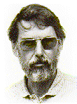
Robert Creeley in the town of Mount Horeb, Wisconsin
courtesy of Special Collections, Stony Brook University
Given his experience as an editor and publisher, Creeley shared a vocabulary with artisans. One of his colleagues told me that he cherished a copy of Robert Bringhurst’s The Elements of Typographic Style he had received for his birthday. Throughout the printing of The Charm, he was in remarkably close consultation on all matters from the nature of the binding to finite typographic decisions. On 24 October 1967, the final batch of proofs were sent to Creeley at 9596 Knoll Road in East Eden, approximately 30 miles south of Buffalo accompanied by a letter on the curious stationary marked “th prshbl prss lmtd.”
The war in Vietnam was on in October 1967. Student activists in Madison began investigating the DOW Chemical Corporation’s role in the production of the NAPALM Bomb. DOW Chemical was a major corporation working in conjunction with the University to seduce recent (predominantly middle-class) graduates with attractive salaries. In anticipation of the DOW recruiters visit to campus in February, the SDS made poster-sized photographs of Vietnamese children burned or murdered by the NAPALM bombs, and displayed them in a picket line outside of the recruitment office. In spite of the charges put forward by SDS, the University protect DOW’s interests by attempting to turn the rhetoric of “free speech” against them as epitomized by Republican State Senator Gordon Roseleip; “… free speech for the recruiter, free speech for the capitalist to make money, free speech for people to kill people.”
On 17 October 1967, demonstrations were taking place in metropolitan areas large and small across America, and at the Pentagon to “confront the war makers.” On the second day of demonstrations the students were engaged in a peaceful protest against DOW at the Commerce Building. After the campus chief of police called for backup, the demonstration soon turned into a massacre when 35 police from the city stormed the building wielding clubs, “just beating the hell out of everyone.” It took twelve minutes to clear the building, as students were carried out with bleeding heads and broken ribs. As they fled from the building, the “war zone” outside continued to swell, and 4,000-5,000 people were exposed to tear gas. Sixty-five were hospitalized. In the midst of all this, there is virtually no mention of politics, the war, or even the massacre on Madison’s campus in Hamady’s letters. The politics and aesthetics of the mid-west Perishable Press and its West Coast contemporaries are striking.
Creeley’s collaborations with visual artists and fine presses flourished in the late sixties. In the spring of 1968, he stayed with Hamady after giving a reading in Madison on Friday, March 22 before leaving for San Francisco Saturday morning. During the visit, they discussed plans for a chapbook. He had just complete the manuscript for Numbers, which would be published later that year with glorious screen prints by Robert Indiana, and Cape Goliard published A Sight with oversized lithographic illustrations by R. B. Kitaj. Bobbie Louise-Hawkins contributed monotypes for “The Finger” and 5 Numbers with rubber stamps by William Katz. Holbrook Teter worked alongside Clifford Burke on the joint publication of Creeley’s collaboration with Okamura, Numbers (1-2-3-4-5-6-7-8-9-0).
When Burke and his family moved from Berkeley to San Francisco in 1966, he found himself, “… smack in the middle of the political and literary upheavals of Berkeley and San Francisco and so the craft of printing and political activism and literary bookmaking all came together in an ‘underground’ print shop called Cranium Press.” He refined his skills under graphic designer Peter Bailey in 1967 and later with Adrian Wilson (1968-1970). As an activist and poet in his own right, Burke developed intimate relationships with other writers in the Bay Area, and Cranium became a hangout where students from the Experimental College, the Black Students Union and other radicals could rap while they learned the art of handprinting. Burke recalls, “I first became interested in type and printing when I was in college, working at a summer job for a small local newspaper. A working print shop is those days (1962), with its antique equipment and fascinating denizens, was still so much like one of the ancient craft guilds that being introduced to the ‘mysteries’ as a youngster made a powerful lasting impression. I can still remember that funky small-town shop and the training I got there in vivid detail. That training outlined a path; subsequent opportunities seemed always to veer toward printing.”
Cranium produced over one hundred books, as well as several hundred broadsides, posters, and other pieces of ephemera by Benveniste, Duncan, Enslin, Ferlinghetti, McClure, Meltzer, Welch, and others. Burke published two important serial projects; the first was the Cranium Press Free Poems, a series of small broadsides that appeared sporadically in the presses’ early days, and later the Maya Quartos, a series of pamphlets containing the work of a single, or multiple authors edited by Burke. The first was Jack Hirschman’s Shekinah (1969). In addition to titles released under the Cranium impression, he printed for the most significant literary small presses of the sixties and seventies, including Hawley’s Oyez!, Jack Shoemaker’s Sand Dollar Poets Press, and Turtle Island.
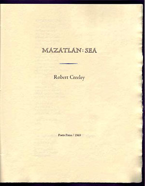
Mazatlan: Sea, title page
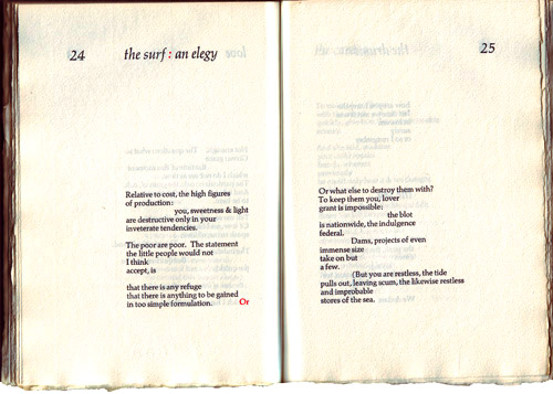
Mazatlan: Sea was published by the Poets Press on 12 August 1969 and printed by Burke. Only fifty copies of this poem, later to appear in Pieces, were produced. It is sewn in rough navy blue cover stock, with a charming open face on the title page. Burke claims that, “… the best printing comes from a creative blending of text and typography, the printer interpreting the writing in visual and kinetic form in such a way that the writing is vivified, made more itself than it was in typescript.” In this case, the writing is not only more “itself” than the typescript, it is more itself than in the trade edition published by Scribners, or the oversized Collected Poems published by the University of California Press. While large collections such as Creeley’s are appropriate for some forms of literary scholarship, the uniformity of the design conceals the particular groundwork of the poems therein.
Although less efficient, small editions offer a clearer context because books have definitive beginnings and ends, different designs, materials, and important paratextual information like colophons, biographical notes, photographs, and blurbs. In short, the little book shows the text in a timely context. From the generous margins, to the texture of the page, to details like the splash of blue ink below the title, verbs like “shimmer” or “flicker” draw attention to themselves in Mazatlan: Sea because the sculptural properties of letterpress printing give words a radiant depth while offset sits on the surface. The long em dashes (“Sleep — it washes / away.”) offer the ear, by way of the eye, a duration of silence distinct from later editions. In the Collected Poems, such savory details, delights and variations are lost.
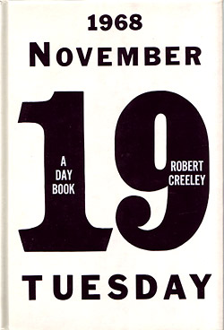
A Day Book, cover
Teter first met Michael Myers in the basement of Cranium Press where he was learning the Linotype with the intention of starting a newspaper with underprivileged teenagers. They went on to establish Zephyrus Image, one of the most inventive fugitive poetry presses of the seventies. Their work embraced local and global political conditions in revolutionary poetic forms that are both lucid and invigorating. Zephyrus Image was in operation between 1970 and 1982, characterized by Johnston as “… a violent period of social upheaval in America coinciding with the Vietnam War, student unrest, the Kent State killings, the Attica Prison uprising (that resulted in the deaths of 29 inmates and 10 guards), the bombing of Cambodia, the Watergate scandal, the Black Panthers, the beginnings of the Women’ s Liberation Movement and the Gay Liberation Movement, as well as the right-wing backlash. There was the Zodiac killer rampaging in California, and here in Berkeley, the People’s Park uprising and the kidnapping of Berkeley art history student and heiress Patricia Hearst by the Symbionese Liberation Army.”
The era that witnessed a swell of NEA grants under the Nixon Administration (a few of which made their way into the pressroom of Michael Myers and Holbrook Teter) allowed their synergistic genius to flourish under the banner of “Zephyrus Image” in the wake of the sixties in San Francisco. Teter was the elder, and more responsible of the two. He was involved in child advocacy programs, civil rights organizations, and like Burke, was active in several environmental, mental health, and peace groups. On the other hand, Myers came to San Francisco from Madison (where he knew Hamady), and enjoyed drugs, skateboarding and pranks. In spite of the prolific nature of the press, very few of their publications and ephemera have survived because they took their message to the streets (or in the case of their first collaboration, the City Dump) as an indirect means of social action and political intervention. Zephyrus Image’s artistry did not depend on the recognition of institutions, special collections or galleries. Their audience was elsewhere.
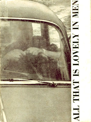
Bill Berkson, Richard Brautigan, Jim Carroll, Tom Clark, Joanne Kyger, Arthur Okamura, Aram Saroyan, and many other poets and artists were his neighbors when Creeley moved to Bolinas in the late sixties. As Johnston notes in his terrific Zephyrus Image: A Bibliography, Creeley had serious reservations about the way Charles Scribners’ and Sons had typeset A Day Book, and asked Teter if he would set the text at Cranium. Creeley described the circumstances to Johnston:
I didn’t know [Holbrook] till we got to Bolinas — and I cannot recall just how we met, but it must have been through Ed Dorn. In any case, I liked him and his wife very much — sweet, bright and very generous people. I so liked his presswork that I managed to talk Scribners into letting him typeset A DAYBOOK — they’d say things like, ‘Does he do it out of a trailor?’ and were very dubious about the whole business. But he did it so cheaply and well, I guess that finally got to them. I was otherwise in touch with Holbrook’s later work, with the homeless in Central America. He was a lovely man.
Salvaging cases of type that were of little interest to commercial printers in the Bay Area, Zephyrus Image combined first edition poetry with original linoleum cuts and found images reproduced from discarded cuts bought from modernizing newspapers and job shops. Their collaborations brought a striking visual sensibility together with a tasteful randomness reminiscent of the Futurists’ appropriation of popular logos and advertisements. Their rejection of commercial art and the gallery scene was a powerful precursor for book artists of the 1980s. After inheriting fourteen boxes of zinc cuts from the San Francisco Public Library, they used the images (originally from a Chinese newspaper that had gone out of business) to anonymously publish One Morning You, a tall, slender book of just twelve pages.
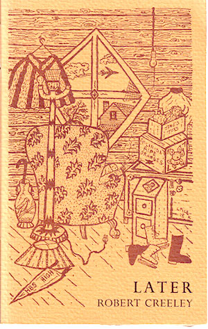
Later, cover
The Toothpaste style carries on in the tradition of Harry Duncan’s typography workshops – encapsulated in his collection of essays, Doors of Perception. Allan and Cinda Kornblum’s Toothpaste Press grew out of Allan’s mimeographed Toothpaste Magazine, a poetry journal he began editing when he moved to Iowa in 1970. Their books are bright, legible and clean. They are constructed with reverence for the art of fine printing and value of material integrity. The pages are primarily unadorned; color combinations are harmonious and subtle, their materials soft and unaffected. There is room to breath, contemplate, and wander here; as if the glorious white margins themselves could block out ambient noise. The handset type is small (sometimes just 9 pt.), giving the poem a quiet but intense disposition on the page, which somehow refuses to feel vacant. As Michael Peich has observed, their house fonts are derived Poliphilus and Centaur, as well as more modern faces like Goudy Modern and Perpetua. Years ago, their display founts include Goudy Open, the “more funky” Flash Bold, and Vaudeville. Just as varied are the papers they use. Their books are made of fine materials and are relatively affordable – but never cheap. I remember Steve Clay telling me how he longed for a copy of Later when he was a student at Iowa.
Andrew Hoyem began printing with Dave Haselwood at the Auerhahn Press in 1961. Two years later, he served an apprenticeship with Edwin and Robert Grabhorn while continuing to work full-time with Haselwood. When Edwin retired from The Grabhorn Press in 1966, Robert Grabhorn and Hoyem began a new joint publishing venture under the Grabhorn-Hoyem imprint and their partnership prospered. As a poet and fine editor in his own right, Hoyem offered a contemporary framework to their focus that differed from that of The Grabhorn Press. They soon became an instrumental and controversial presence in the fine press and literary scenes of the Bay Area in the late sixties and early seventies, producing an excess of fifty editions by Olson, Berrigan, Pound, Creeley, Montale, H.D., and Ginsberg, as well as classics such as Chaucer’s ABC, The Pearl, An Anglo-Saxton Gnomic Poem and Mother Goose. Robert died in 1973. Shortly thereafter, Hoyem acquired all of the Grabhorn Press equipment and type.
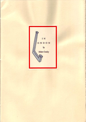
In London, cover
Creeley’s In London was produced in an edition of 200 by Grabhorn-Hoyem in 1970 for Angel Hair Books in Bolinas, an extension of Warsh and Waldman’s classic mimeo magazine of the same name. It is a fine example of a direct convergence between the mimeo revolution and the fine press renaissance. The poem was written on 14 July 1969, and takes the form of a modest pamphlet secured by a single string. The sequence is composed of short sections, lyrical and playful, “There is a land/far, far away/and I will go there/every day.” Some fragments are ephemeral, matter-of-fact propositions, “‘London/Postal Area/A-D” or “It’s 2 hrs. 19 mins. from London/in the train to beautiful country.” These are interspersed with sexual allusions and puns: “I keep coming—/I keep combing my hair.” “Surrounded/ by bad art.” The book was “…written while staying in London at the apartment of Bettina and John Calder, my English publisher. It was an extraordinary time, and just the evening previous I had gone with novelist and friend Ann Quinn to hear Ted Berrigan and Jim Dine (who was living in London) read together at a local gallery. Earlier that same evening, I had read with Robert Bly and others at London’s International Poetry Festival, which was the reason for my being in London in the first place. The next morning, now alone in the Calders’ apartment – with books, art, Bettina’s piano and music scores, and people variously outside cleaning the windows – I started marking a kind of pot pourri of echoes, musings, reflections, notes, a shorthand for all the rush of impressions and feelings, which the city provoked in me. The form, so to speak, was akin to the one I had used for ‘Pieces,’ and it was very much a preoccupation for me then to manage a ‘frame’ which could include such a variety of formal and/or rhetorical materials with immediacy and close juxtaposition. It was, as the poem says, ‘the song of’ that multiplicity I was most drawn to, in what I was trying to do in this poem.”
It would be impossible to neatly summarize Creeley’s typography here, and I’ve said nothing of all about the small presses and magazines he has inspired through the years. Punk rock at heart, Bob’s work appeared in publications of all levels of stature from the beginning until the end. He was as generous in offering his poems to budding low-fi magazines as he was to the most renown. Other extraordinary letterpress printers I should have or should have mentioned include: Charles Alexander, Peter Blum, Stan Bevington, Steve Clay, Phil Gallo, Barry Hall, Peter Koch, Katherine Kuehn, Graham Macintosh, John Martin, Alan Loney, Tom Raworth, Peter Quartermain, Noel Young, Rosmarie Waldrop, and of course, many more.
¶
The morning of the reading saw me heading off in a rusty yellow pickup with orange lights over the cab, making at least one false turn on Vermont’s curly dirt roads before eventually finding Bob (whom I called ‘Mr. Creeley’) at the Vermont Studio Center. His head popped out from behind the door of a bright room into a dark hallway on the second floor. As we made our way back to Goddard College, I remember offering him a “bullet” (an unfiltered Camel cigarette like the ones I saw him smoking in black and white photographs). He quit. He was a talker. It was loud inside the cab. I remember nodding and laughing nervously when I couldn’t make out what he was saying – sure that I couldn’t or shouldn’t say, “come again?” again.
By that time I had purchased my first printing press, a George Prouty & Sons platen, and moved it into a converted milking shed. The early experiments were full of blunders and wonders: broken chases, inky fingers and dropped cases. There was no instruction in typesetting at the time, so we followed in the Deweyan tradition of “finding out for ourselves.” We printed the College’s literary review, compost-toilet instructions for the Ecology house, broadsides for the Hubris reading series, stationery for Gertrude Stein, and a few short poems. The walls of the shed were covered with broadsides, proofs, and a prominent printers’ devils cheat sheet for our California job cases. For me, typography was the ideal intersection of poetry, sculpture, and visual art. In fact, I identified more as an artist than a writer until one of my sculpture professors gave us the daunting task of “building” Olson’s “Projective Verse.” I never finished the project, but happily became immersed in Pound, Creeley, O’Hara, and Ashbery because I thought their essays engaged with and responded to the artists they were writing about – an ethical stance quite unlike the more conventional forms of art history and criticism I was reading at the time. I thought of Creeley as an essayist because A Quick Graph was the first book of his I really latched onto. Perhaps part of what accounts for the intimacy of Creeley’s essays at large, and his writing on artists in particular, is the fact he rarely addressed the work of people he didn’t know personally. His essays are consistently and pleasantly devoid of jargon and the dangers of whimsical categorization.
He asked (point blank) why I would bother setting type by hand when electronic and digital publishing were so much more efficient, “… certainly, if we had the technology of the Electronic Poetry Center we would never have published the Black Mountain Review the way we did.” I didn’t know what to say. Perhaps I still don’t. I didn’t tell him, for example, that up until very recently, I would transcribe computer printouts of my poems on a manual typewriter because I liked the way it forced me to slow down to consciously slug out one letter at a time. I suppose that setting type by hand has a similar effect – make every letter (and the spaces between them) count as a construct in space. When I listen to Bob read his poems, I can almost discern the typewriters’ “click” in the measure. Tall order, but one that I think he aspired to – Wittgenstein’s desire to write a book of philosophy “without gassing.” As if time were as still as those black and white photographs, I imagined that this was way that he still wrote his poems. Quite the contrary. All forms of media have a limited lifespan. The letterpress, mimeograph, postcard, typewriter, fax machine, photocopier, telegraph, record player, DVD, CD-ROM, internet, and e-mail all had their own time and place in Creeley’s life and work.
¶
My thanks to Mike Basinski, curator of the Poetry Collection, University at Buffalo, The State University of New York, for his generous permissions to reproduce the images that appear above.
The photo of Robert Creeley in Mt. Horeb is courtesy of Special Collections, Stony Brook University.
— KS 9.28.06
Varityper
[*] The varityper is the proprietary name of a kind of typewriter that has interchangeable typefaces (like the IBM Selectric,) and a kind of type-composing machine with similar operation.
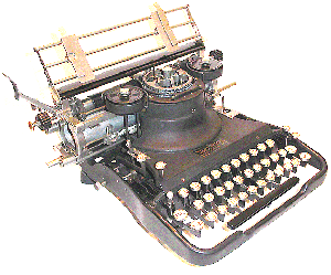
[†] Linotype is the proprietary name of a composing machine invented by Ottmar Mergenthaler (1854–99) that sets type line by line (see photos below). In the late 19th century, A. Powell wrote, “The Linotype sets up not types, but type-matrices, and then, when a line is complete, passes the matrices on to a foundry which forms part of the apparatus, and a full line is cast… Distribution is avoided. The matter once used, is returned to the metal pot and melted ready for fresh work. The advantages of the machine are its great speed and the economy effected by melting instead of distributing. A disadvantage is the fact that there is no mode of correction other than to reset the whole line.”
[‡] The poems published in the first edition of Words are: “To Bobbie,” “Words,” “A Reason,” “The Shame,” “The Statue,” “The Window,” “To Bobbie (2),” “The Flower,” and “A Prayer.”
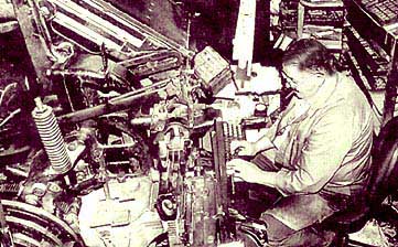
Linotype machine
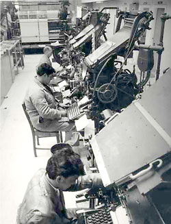
Linotype operators, Wairoa Star newspaper, New Zealand, 1983